Off the Top: Interaction Design Entries
Showing posts: 1-15 of 205 total posts
Strong Opinion About Slide Over on iPadOS
I should say up front, I’m deeply appreciative of Apple and all the products, OSes, services, and applications they make, as most everything is done with care and craft with and eye and understanding of detail. Having interactions with develop support and internal developers now and over the years, I’ve always been impressed in their focus on getting things right and doing thing better. Nearly every interaction with Apple from customer support, sales support, Apple’s developers, and people inside Apple has been fantastic and from people who aim to do their best and look to make really solid products and services for their customers.
Apple Announces the New ipadOS
At this month’s Apple WWDC 2025 they made the announcements about the new ipadOS 26, which seems like it may be a good step forward with the new windowed interface, that moves it into looking and acting much like a Mac. There are many other updates and improvements.
Subtraction of Productivity is Far from an Improvement
But… subtraction of one prime productivity advancement that the iPad has had for many of its iterations is that of Slide Over, which if you aren’t familiar (it seems Apple isn’t), is the ability to have an app that will slide in from the side of the screen and hover in a narrow mode, while the other app (or apps, as two apps on screen has been around for a while as well) is still in view.
This meant, with one flick and (in Steve Jobs’ parlance) boom! you have a note app (my strong preference has been for Drafts) that allows me to capture ideas in markdown quickly and then (or later) push the note out elsewhere - Twitter, Mastodon, note directories that Obsidian sits over, Messages, etc.) then flick it back out of the way. It is simple, quick, efficient, and productive, which is what Apple always seemed to put as a priority.
I often have Drafts and PCalc sitting one flick (two for PCalc for the second flick), which is ONE STEP to get a productivity app of my choice in place to divert my focus from a video I’m learning from, reading I’m wanting to capture a note or to do from, a quick calculation, or whatever I want to need at the ready and then get back to focussing. This is a super power that iPad has enabled. It is what separates an iPad apart from Mac and other devices in a big way.
The New ipadOS 26 is Four Large Steps Backward for One Element of Productivity
This new window model on ipadOS 26 is nice and could be helpful, but trying to do the same quick productivity action is at minimum four steps. That isn’t a productivity gain or enhancement. That is four large steps backward Apple. Four anti-productivity steps backward. If I wanted to lose productivity like that, I would switch to Windows.
The corner quick swipe from the corner of the iPad isn’t available unless I’m using the full window interface for finger use and only getting access to Apple Notes (a really nice product, but for various reasons isn’t my first choice, nor second choice). In the new interface the quick corner access is available with Pencil swipes. The full window interface you can add a finger swipe.
But, going from a window I’m working or learning in and want to get a Drafts up and ready, if I have it in my dock it is a tap to open, get it out of the way (often two moves for placement and then narrowing it, if not also adjusting the window I’m also using, and then typing in Drafts) and that is the quickest way. Spotlight is the other option, which adds a step.
It Is an iPad not A Mac
Apple, this device is the iPad it isn’t a Mac, it has special super powers, which include the ability to help focus and be productive. With this new ipadOS 26 new functionality and capabilities are added that are helpful, but don’t take away the iPad’s strength as well. It may be those leading iPad don’t live with it as a core device and don’t care about its strengths and super powers, or they don’t understand productivity so they slipped up.
The windowed world of ipadOS 26 could easily have Slide Over and keep the super power of one flick for productivity. I’m hoping the fall release of ipadOS 26 still includes the productivity super power that sets the iPad apart and allows its users to have super productivity powers that help set them apart with the partnership of Apple’s products helping them be their best.
The Writing Ache
It has been a while since I’ve written here, or over at Personal InfoCloud. I have an even larger stack of things in my writing queue and it is getting to the point that I am aching to write.
Shift Happened
I have a few things I really want to and need to get out. One is to take the Shift Happened series I started and made it through 4 of 16 I have outlined and I am finding the shifts myself and others saw and were living and advising through, happened to far more and they are really lost and acting as if these shifts never happened. Still.
Complexity / Social Lenses
The other thing is my Complexity / Social Lenses are now numbering in the 70s and I need to write to frame the core 12 or so I often use as half-day or full-day workshops to help others see through the fog of complexity with social and other complex environments they work and live within. I have been hoping to get these into a book, but the timing either wasn’t right or the environment (publishing company) shifted.
Information Strata
The last of these is around information depth, which I started relabelling Information Strata, that I have been including in client work and as one of the lenses related to social objects / socially mediated objects (depending if it was Jyri Engstrom or Karin Knor Cetina as one’s entry point). Information strata gets back to the core point and realization in the early 2000s that having a discussion with the subject in clear sight drastically improves the depth of the conversation, reduces errors from lack of clarity or misunderstanding, and improve conversational (information sharing) efficiency. Somehow today that basic concept is really lost and people accept the poor communication patterns as a given or don’t think to investigate a better way.
Over the last 10 years or so I started using a point system around the layers inhibiting a person from having a clear view of what is being discussed. This concept of having a clear understanding and isn’t new, it was something I learned as a communication major in many dog years ago as an undergrad. I need to do a decent write-up of this to have something to point to when helping others. I’m also realizing Info Strata leads right back to the “[Come to Me Web]” and related matters where the importance of bringing things related near has prime importance when building a service and system for someone to live and work with.
Now what I need is time and stability at the same time to get these going. Oh, and to get the ever bumped side project moving forward again.
Animoji Trains Future Interaction Interface
In the September 2017 Apple iPhone 8 and iPhone X announcement Keynote they demonstrated the Apple ARKit driven face emoji, Amimoji. This is similar to other platform’s and service’s offerings.
But, there is something I think a little different about what Apple is doing. One piece is the face identification system that Apple has in the iPhone X and the 30,000 dots it uses on people faces to ascertain an identity, which makes it difficult for someone to use a photo or mask of a person to gain access. The other piece is people interacting with their screens and the live face scans of muscles and facial features moving.
It is this second piece, the live interaction where I have a strong hunch Apple is seeding things for the future. People are learning to interact with a facial scan interface for fun and learning the capabilities so to be comfortable with it. This seems very similar to Microsoft’s using the Solitaire game in early Windows to provide a fun interaction as a means to train people how to use a mouse and get comfortable with it.
Look out a few years and start to see not Animoji, but people talking to Siri to bring up an app on their wrist, car heads-up display, or (rather banal) iPhone and use facial interactions to swipe, scroll, sort, etc. feature options and light contextual information options for simple / calm interfaces. A raise of the eyebrow could scroll up options, a side smile left moves to preferred options and side smile right moves to next screen.
I know nothing other than a hunch, but playing around with this idea for years, I’m seeing the potential could be around the corner. Finally. Maybe. Come on Apple, lets take that step.
Khoi Turns Infocards into Wildcard
This past week one of my favorite designers, Khoi Vinh released a product for iOS that is a great play on information card UI called Wildcard. Khoi has a really good write-up of the journey launching Wildcard.
Wildcard is Best When Used
The real joy is in using Wildcard. Khoi created a wonderfully usable and quite intuitive UI and interaction model all based on information cards, which work wonderfully on mobile and other constrained UI devices. Wildcard is a mix of news summary and scrolling service and product finding service.
Information cards are often mis-used and misunderstood. Both Google and Twitter started in with adding infocards to their design and information structuring a few years back. Both did this as a means to surface well chunked and structured content into small chunks for mobile and other UI constrained interfaces, but also for information scanning and lite representation interfaces and interaction models, like Google Now and the Twitter stream. The model does not work as well on fuller information and content sites, as it constrains in ways that are not moving things forwards, but instead setting false arbitrary constraints.
An Interconnected Service
One of the great pleasures in Wildcard is it not only has its own hold onto for later interaction and service, but it has fully integrated sharing with others and into your own services where you track, store, and manage your information nuggets. It does a really good job of integrating into one’s own personal knowledge flows and capture services.
Far too many services (see (unfortunately) Medium as example of current balkanization from other services) have been shifting to make it difficult for the reader and user of their content to work with the content as they wish and need in their information flows. This fracturing means it is more difficult to share and attribute content (and send people to the site) when blogging or other write-ups.
Khoi has long understood the value of information relationships and information flows for use and reuse, which shows brightly here in Wildcard.
Moved Wildcard to the Front Row
After spending about 15 minutes with Wildcard in my first use of it, it moved to the front row of my “News” folder in my iOS devices. It may become one of my first go to apps to see what is happening in the world around me.
A Model Interaction App
One of the things that struck me in my first use was the intuitive interaction model and information model for moving into a collection and around and deeper in the collection and then back out. Wildcard is really well done on this front. It is one of those things where when I am done using it the ease of use (for the most part - there are one or so “wha?” moment, but for a just launched product that is great) really stands out and I start working through how it works and functions. I’m likely going to have a sit down with it not to use it, but to map out what it is doing, because for me its interaction design is really good and fluid.
It is always a joy to find an app or service that not only does its job well and seems to get out of the way, but works to augment your workflows and existing resources for use and reuse. But, when it stands out as a really easy to use service on first use and good for discovery and exploring, it is worth sitting and better understanding the how and why it does that so I can better think through options and paths for things I am working on or advising.
Kudos Khoi!
New Adoption Points
One of those things where, yet again, realize you have a really quick personal adoption threshold when a new device fills in and you start wondering why everything can’t be logged into with a fingerprint. Then there is the, “why are you calling me on my payment device?”
It has been over 30 years of having new devices arrive at semi-regular pace and quickly disrupting things for workflows around devices and interactions, which is followed often by relatively quick adoption and getting used to a new mental model that makes things a little easier. This is really true for software that is buggy and never really fixed and where I (as well as other humans are the human affordance system).
The Software Counter Model to Quick Change Adoption
As much as new physical hardware and software interaction model shifts largely causes little difficulty with changing for more ease of use, the counter to this with software with a lot of human need for grasping mental models. It is particularly difficult when structuring mental models and organization structure before using software is something required.
There have been some good discounts on Tinderbox across podcasts I listen to or websites around Mac productivity I read, so I nabbed a copy. I have had long discussion around Tinderbox for over a decade and it has been on my want list for large writing and research projects. I have had quite a few friends who have been long time users (longer than I have been a DevonThink user), but I don’t seem to have one in my current circle of colleagues (I you are one and would love to chat, please reach out).
I have a few projects that I think would make great sense to put into Tinderbox, but not really grokking the structure and mental model and flows - particularly around what I wish I would know when I have a lot of content in it. It is feeling a lot like trying to read Japanese and not having learned the characters. I also wish I had kept better notes a few years back when I was deeply sold on a need for Tinderbox, but didn’t capture a detailed why and how I thought it would work into workflow.
Some Tools are Nearly There as a Continual State
I have some software and services that I use a fair amount with hope that they will get much much better with a few relatively small things. Evernote is nearly always in this category. Evernote is a good product, but never gets beyond just good. The search always falls apart at scale (it was around 2,000 objects and had about doubled that scaling threshold pain point) and I can’t sort out how to script things easily or remotely drop content into the correct notebook from email or other easy entry model. There are a lot of things I wish Evernote would become with a few minor tweaks to support a scalable solid no (or very few faults tool), but it never quite takes those steps.
Their business tool offering is good for a few use cases, which are basic, but getting some smart and intelligence uses with better search (search always seems to be a pain point and something that DevonThink has nailed for 10 years) would go a really long way. Evernote’s Context is getting closer, but is lacking up front fuzzy, synonym, and narrowing search with options (either the “did you mean” or narrowing / disambiguation hints / helps).
We will get there some day, but I just wish the quick adoption changes with simple hardware interaction design and OS changes would become as normal as quickly with new other knowledge and information tools for personal use (always better than) or business.
Designing Advanced Deisgn - Julian Bleeker notes from Kruzeniski Workshop
Every now and then I run into a post that brings back that passion and understanding at what is at my core. A post that I wish I wrote or had been able to express what is there at the core. A post with so many great bits that if I high lighted the great parts the whole thing would be yellow (not that I highlight much in yellow (more of orange, pink, and blue sort of guy).
Julian�s Notes from the Workshop on Designing Advanced Design
But enough expounding, what tickled my interest is Julian Bleeker's IxD 2011 Designing Advanced Design Workshop blog post which are notes from Micke Kruzeniski's IxDA workshop (you know, like the title says). The workshop exercise is interesting, but there this post really is enjoyable for me are the insights and everything that follows.
The focus on optimization and efficiency at a set size for certain processes and outcomes is critical. Once you scale beyond that efficiency decreases and costs rise. This lesson is one I see many small and smallish companies run up against. This can be really interesting to watch with internet-based products as it takes many people to keep something up and running and optimized, even when the design, functionality, purpose, and interactions with the service really haven't changed with the only change being there are many more people hitting and using the service than there were prior. In theory you are not producing any more of anything as it is all a copy of digital internet thing “X”, which sole ingredient is energy to appear as an interactive (or even static) internet object or interface elsewhere.
I also like this illustrative piece in the workshop as it brings to the forefront something I continually ponder as a differentiation crack between the US and Europe (possibly elsewhere in the world, but I don't have those examples) on production of things. In the US the common push is to get big and dominate, but in Europe, there are so many people who produce at a scale that gives them optimal quality and they do not move beyond that scale. As long as the crafts people can create a product at a scale that they can make a living and have the product be the best it can be without sacrificing quality they know their production threshold and where to stop. They have perfection in their mind and they have no or little interest in moving beyond that strict measure. (This European sense of quality is surfacing in locally grown food and artisan food circles in the US and other crafts.)
Krizeniski's 3 Approaches to Advanced Design
The Kruzeniski's workshop put a focus on 3 approaches to advanced design, which really require skilled designers who deeply understand their specialization, depths knowledge of materials, and the process of creation in that field. (A theme that surfaces in the BBC's Genius of Design, which I reviewed).
The three approaches are: 1) the Outlier, which works in “what if?” scenarios; 2) The Pantry that builds and iterates and tucks all of these steps and creations away to have on hand at some later point; 3) The Northstar, which takes a long view at the potential in the future and works toward that over time (see the Audi incremental iterations from future concept car to real product in the R8 that is used as an example).
There is so much more in Julian's collection of notes and insights found and shared in the workshop, that the whole piece is well worth a read.
Late to Realizing Ovi Maps Does Exactly What I Wish
I been a big fan of Nokia's mapping solution built into its smart phones, Ovi Maps as it provides the best mobile turn by turn directions I've seen on any mobile device. But, this is largely because Nokia owns Navteq, which has long been the leader for on board mapping and driving solutions.
That FINALLY! Moment Reached
While I have been incredibly impressed with the Ovi mapping on my Nokia E72 device and often use the Ovi resources on the web, I hit that finally, somebody got this right moment with Ovi over the weekend. While, many web mapping solutions allow you to save favorites on the web getting those to sync to your mobile device, with your directions has been left out of most of these solutions (I have been complaining to friends at Google, Yahoo, and elsewhere for many years that this is a no-duh next step). Well, it seems Ovi figured this out quite a while back. (I noticed Google Mobile Maps provided this at the end of 2009, but have never been able to get it to work, even on my supported Symbian device.)
The simplicity and ease with with Nokia's Ovi pulls this off is rather stunning. With this aha moment, I feel like I was the last one to see this and sort it out, but in chats with other mobile maps and navigation users, they have been pained waiting for exactly this functionality, as most people it seems will get a location link and add it to their desktop maps (particularly for travel) but that does them little good as they don't take their desktop or open laptop into the car with them, they take their mobile. Understanding context of use is incredibly valuable.
Now may be a good time to check your device's capability, although iPhone does not seem to have this functionality supported by Google maps (surprised?).
The Genius of Design - BBC Series Overview
This past Summer (2010) the BBC (BBC 2) showed a five part documentary series on design, called The Genius of Design (TGoD). This series is similar to Gary Hustwit's Objectified, but TGoD goes much broader and deeper offering a better reflection of the reality of design only seen through that depth. Think of Objectified as a taste sampler of TGoD. There are some people in common between the two whom are interviewed and focussed upon, but life is breathed into architecture, process, visual, industrial, and many more slices of the design world that bring design to life in TGoD. It is a wonderful look at the real nature of design.
The Five Episodes of The Genius of Design
The five episodes are: 1) Ghosts in the Machine; 2) Designs for Living; 3) Blueprints for War; 4) Better Living Through Chemistry; 5) Objects of Desire. The core focus is on the deep consideration and understanding that goes into design. It is this rigor of understanding and working through to final product all based on a core objective. Throughout the five series the focus on a deep understanding the materials deeply, use, impact on the people interacting with what has been designed, and development processes (as well as optimizing them).
Standout Themes
The obsession to understand the materials used and objects being design with depth and breadth is not the only standout theme. Many other themes and take away ideas stood out not only when watching, but also now many months later.
Focus on End Use and People Using Product of Design
One major reoccurring theme throughout is the focus on end use. The the products not only should be pleasing nearly (possibly to the point of being emotive), but they must also be usable, and do what it is intended to do very well. A continual focus on the person using what is designed is one of the central tenets of design and with out this it is something other than design.
Breadth of Design Disciplines and Roles
To the point of design having a focus on the person using what is designed, the breath of roles within design was brought up. Wonderfully, Peter Boersma's T-Model was directly mentioned in when discussing the breadth of expertise with required depth and roles in design that are required to all come together to optimally create a final product that is please and usable for the person who engages with the final product. While watching the whole series the focus on various disciplines and roles is very evident and when listening to the designers talk about their own focus and discipline (all largely falling under the moniker of design) as it relates to final crafting of the final object) it is they all have depth in their own discipline, but understand the materials deeply and the class and required needs for the final product very well.
Every Designer Has A Chair In Them
Another reoccurring thread, that gets depth of focus a few times, is the idea that every designer has a chair in them (this has become a meme in the broad design community from the near instant this was uttered mid-Summer). The chair is emblematic of the need for utility (purpose, comfort, durability, etc.) as well as providing style. A chair that collapses is not well designed. The chair also often has requirements beyond basic sitting, which can include long term comfort, ability to stack and store it, be environmentally friendly, and many more possible variations. This intersection of use, style, material, and production around the chair leads to a lot of the depth of understanding required to get to a final product prototyped, tested, and into production. This depth and breadth that designers put in is often not considered by people outside the design community, but also the depth and rigor involved in design is missed in some disciplines that are tangential to design, but do not consider themselves purely in the design profession.
Process Design and Optimization
Within the Blueprints for War episode the focus of designing the process was often repeated. The episode focussed on Britain in World War II and the need to have mass production of goods needed for the war that worked for their purposes, but there were limitations of materials and time needed to get mass amounts of goods in military personnel�s hands. Streamlining production and simplifying the goods became essential, but as well thinking of solutions seemed like their was expansive production (dummy planes, etc.) and alternate facilities (fake factories) were included in the design mix.
Wishing for More
In all this was a fantastic series for those in and around the design profession, those who intersect with design, and just fans of design.
January 2011 Books Read
My monthly list of books read is something I have had in mind for a long time. I was inspired by Matt Webb's book list which he was doing for a while years back. Not only is the sharing out with others helpful, but it also helps me finish reading a book.
Books read January 2001 with short summaries.
- Shibumi: A Novel by Traviathan
- A really good thriller set in Japan and Europe. Not only was the story good, but the details and a good cultural view of Japan during World War II. This book caught and held my attention early and I really enjoyed it.
- Halting State by Charles Stross
- This thriller set slightly in the future where MMORPGs start intertwingling with life. A bank robbery occurs in the game which starts the whole story rolling. The interplay and storyline between virtual games and physical life interwoven with its pervasive digital layers we depend on today is really well done.
- Business Model Generation: A Handbook for Visionaries, Game Changers, and Challengers by Alexander Osterwalder and Yves Pigneur
- Business Model Generation is a surprise gem in that I had heard very good things about it and a quick skim of it in a bookstore convinced me to pick it up. But, the design, layout, and thoughtful thinking of how it steps through the model for understanding and thinking through business models is nothing short of stellar. The stuffy, staid, and often broken world of business models got tipped on its ear through design and understanding that makes walking through creation of a business model a sane process, but also leads to rethinking existing models for whole organizations or parts. It is a great way to look to see where software and services can have a positive impact when mapping out an organizations model.
- Smart Things: Ubiquitous Computing User Experience Design by Mike Kuniavsky
- Smart Things is a fantastic walk through design considerations and methods for information interfaces for and streams from physical products. This book is very well thought out, well written and augmented with examples and very well produced. Not only is this a great book for designers, but for people working through ideation, iterations, and innovations for improving information use in, from, and with the world of things around us.
Social Design for the Enterprise Workshop in Washington, DC Area
I am finally bringing workshop to my home base, the Washington, DC area. I am putting on a my �Social Design for the Enterprise� half-day workshop on the afternoon of July 17th at Viget Labs (register from this prior link).
Yes, it is a Friday in the Summer in Washington, DC area. This is the filter to sort out who really wants to improve what they offer and how successful they want their products and solutions to be.
Past Attendees have Said...
�A few hours and a few hundred dollar saved us tens of thousands, if not well into six figures dollars of value through improving our understanding� (Global insurance company intranet director)
From an in-house workshop�
�We are only an hour in, can we stop? We need to get many more people here to hear this as we have been on the wrong path as an organization� (National consumer service provider)
�Can you let us know when you give this again as we need our [big consulting firm] here, they need to hear that this is the path and focus we need� (Fortune 100 company senior manager for collaboration platforms)
�In the last 15 minutes what you walked us through helped us understand a problem we have had for 2 years and a provided manner to think about it in a way we can finally move forward and solve it� (CEO social tool product company)
Is the Workshop Only for Designers?
No, the workshop is aimed at a broad audience. The focus of the workshop gets beyond the tools� features and functionality to provide understanding of the other elements that make a giant difference in adoption, use, and value derived by people using and the system owners.
The workshop is for user experience designers (information architects, interaction designers, social interaction designers, etc.), developers, product managers, buyers, implementers, and those with social tools running already running.
Not Only for Enterprise
This workshop with address problems for designing social tools for much better adoption in the enterprise (in-house use in business, government, & non-profit), but web facing social tools.
The Workshop will Address�
Designing for social comfort requires understanding how people interact in a non-mediated environment and what realities that we know from that understanding must we include in our design and development for use and adoption of our digital social tools if we want optimal adoption and use.
- Tools do not need to be constrained by accepting the 1-9-90 myth.
- Understanding the social build order and how to use that to identify gaps that need design solutions
- Social comfort as a key component
- Matrix of Perception to better understanding who the use types are and how deeply the use the tool so to build to their needs and delivering much greater value for them, which leads to improved use and adoption
- Using the for elements for enterprise social tool success (as well as web facing) to better understand where and how to focus understanding gaps and needs for improvement.
- Ways user experience design can be implemented to increase adoption, use, and value
- How social design needs are different from Web 2.0 and what Web 2.0 could improve with this understanding
More info...
For more information and registration to to Viget Lab's Social Design for the Enterprise page.
I look forward to seeing you there.
![Reblog this post [with Zemanta]](http://img.zemanta.com/reblog_e.png?x-id�67bb8b-4652-46bc-bc0d-996c1a2d5205)
Catching Up On Personal InfoCloud Blog Posts
Things here are a little quiet as I have been in writing mode as well as pitching new work. I have been blogging work related items over at Personal InfoCloud, but I am likely only going to be posting summaries of those pieces here from now on, rather than the full posts. I am doing this to concentrate work related posts, particularly on a platform that has commenting available. I am still running my own blogging tool here at vanderwal.net I wrote in 2001 and turned off the comments in 2006 after growing tired of dealing comment spam.
The following are recently posted over at Personal InfoCloud
SharePoint 2007: Gateway Drug to Enterprise Social Tools
SharePoint 2007: Gateway Drug to Enterprise Social Tools focusses on the myriad of discussions I have had with clients of mine, potential clients, and others from organizations sharing their views and frustrations with Microsoft SharePoint as a means to bring solid social software into the workplace. This post has been brewing for about two years and is now finally posted.
Optimizing Tagging UI for People & Search
Optimizing Tagging UI for People and Search focuses on the lessons learned and usability research myself and others have done on the various input interfaces for tagging, particularly tagging with using multi-term tags (tags with more than one word). The popular tools have inhibited adoption of tagging with poor tagging interaction design and poor patterns for humans entering tags that make sense to themselves as humans.
LinkedIn: Social Interaction Design Lessons Learned (not to follow)
I have a two part post on LinkedIn's social interaction design. LinkedIn: Social Interaction Design Lessons Learned (not to follow) - 1 of 2 looks at what LinkedIn has done well in the past and had built on top. Many people have expressed the new social interactions on LinkedIn have decreased the value of the service for them.
The second part, LinkedIn: Social Interaction Design Lessons Learned (not to follow) - 2 of 2 looks at the social interaction that has been added to LinkedIn in the last 18 months or so and what lessons have we as users of the service who pay attention to social interaction design have learned. This piece also list ways forward from what is in place currently.
Optimizing Tagging UI for People & Search
Overview/Intro
One of my areas of focus is around social tools in the workplace (enterprise 2.0) is social bookmarking. Sadly, is does not have the reach it should as it and wiki (most enterprise focused wikis have collective voice pages (blogs) included now & enterprise blog tools have collaborative document pages (wikis). I focus a lot of my attention these days on what happens inside the organization�s firewall, as that is where their is incredible untapped potential for these tools to make a huge difference.
One of the things I see on a regular basis is tagging interfaces on a wide variety of social tools, not just in social bookmarking. This is good, but also problematic as it leads to a need for a central tagging repository (more on this in a later piece). It is good as emergent and connective tag terms can be used to link items across tools and services, but that requires consistency and identity (identity is a must for tagging on any platform and it is left out of many tagging instances. This greatly decreases the value of tagging - this is also for another piece). There are differences across tools and services, which leads to problems of use and adoption within tools is tagging user interface (UI).
Multi-term Tag Intro
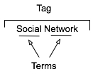 The multi-term tag is one of the more helpful elements in tagging as it provides the capability to use related terms. These multi-term tags provide depth to understanding when keeping the related tag terms together. But the interfaces for doing this are more complex and confusing than they should be for human, as well as machine consumption.
In the instance illustrated to the tag is comprised or two related terms: social and network. When the tool references the tag, it is looking at both parts as a tag set, which has a distinct meaning. The individual terms can be easily used for searches seeking either of those terms, but knowing the composition of the set, it is relatively easy for the service to offer up "social network" when a person seeks just social or network in a search query.
One common hindrance with social bookmarking adoption is those familiar with it and fans of it for enterprise use point to Delicious, which has a couple huge drawbacks. The compound multi-term tag or disconnected multi-term tags is a deep drawback for most regular potential users (the second is lack of privacy for shared group items). Delicious breaks a basic construct in user focussed design: Tools should embrace human methods of interaction and not humans embracing tech constraints. Delicious is quite popular with those of us malleable in our approach to adopt a technology where we adapt our approach, but that percentage of potential people using the tools is quite thin as a percentage of the population.. Testing this concept takes very little time to prove.
So, what are the options? Glad you asked. But, first a quick additional excursion into why this matters.
Conceptual Models Missing in Social Tool Adoption
One common hinderance for social tool adoption is most people intended to use the tools are missing the conceptual model for what these tools do, the value they offer, and how to personally benefit from these values. There are even change costs involved in moving from a tool that may not work for someone to something that has potential for drastically improved value. The "what it does", "what value it has", and "what situations" are high enough hurdles to cross, but they can be done with some ease by people who have deep knowledge of how to bridge these conceptual model gaps.
What the tools must not do is increase hurdles for adoption by introducing foreign conceptual models into the understanding process. The Delicious model of multi-term tagging adds a very large conceptual barrier for many & it become problematic for even considering adoption. Optimally, Delicious should not be used alone as a means to introduce social bookmarking or tagging.
We must remove the barriers to entry to these powerful offerings as much as we can as designers and developers. We know the value, we know the future, but we need to extend this. It must be done now, as later is too late and these tools will be written off as just as complex and cumbersome as their predecessors.
If you are a buyer of these tools and services, this is you guideline for the minimum of what you should accept. There is much you should not accept. On this front, you need to push back. It is your money you are spending on the products, implementation, and people helping encourage adoption. Not pushing back on what is not acceptable will greatly hinder adoption and increase the costs for more people to ease the change and adoption processes. Both of these costs should not be acceptable to you.
Multi-term Tag UI Options
Compound Terms
I am starting with what we know to be problematic for broad adoption for input. But, compound terms also create problems for search as well as click retrieval. There are two UI interaction patterns that happen with compound multi-term tags. The first is the terms are mashed together as a compound single word, as shown in this example from Delicious.
The problem here is the mashing the string of terms "architecture is politics" into one compound term "architectureispolitics". Outside of Germanic languages this is problematic and the compound term makes a quick scan of the terms by a person far more difficult. But it also complicates search as the terms need to be broken down to even have LIKE SQL search options work optimally. The biggest problem is for humans, as this is not natural in most language contexts. A look at misunderstood URLs makes the point easier to understand (Top Ten Worst URLs)
The second is an emergent model for compound multi-term tags is using a term delimiter. These delimiters are often underlines ( _ ), dots ( . ), or hyphens ( - ). A multi-term tag such as "enterprise search" becomes "enterprise.search", "enterprise_search" and "enterprise-search".
While these help visually they are less than optimal for reading. But, algorithmically this initially looks to be a simple solution, but it becomes more problematic. Some tools and services try to normalize the terms to identify similar and relevant items, which requires a little bit of work. The terms can be separated at their delimiters and used as properly separated terms, but since the systems are compound term centric more often than not the terms are compressed and have similar problems to the other approach.
Another reason this is problematic is term delimiters can often have semantic relevance for tribal differentiation. This first surface terms when talking to social computing researchers using Delicious a few years ago. They pointed out that social.network, social_network, and social-network had quite different communities using the tags and often did not agree on underlying foundations for what the term meant. The people in the various communities self identified and stuck to their tribes use of the term differentiated by delimiter.
The discovery that these variations were not fungible was an eye opener and quickly had me looking at other similar situations. I found this was not a one-off situation, but one with a fair amount of occurrence. When removing the delimiters between the terms the technologies removed the capability of understanding human variance and tribes. This method also breaks recommendation systems badly as well as hindering the capability of augmenting serendipity.
So how do these tribes identify without these markers? Often they use additional tags to identity. The social computing researchers add "social computing", marketing types add "marketing", etc. The tools then use their filtering by co-occurrence of tags to surface relevant information (yes, the ability to use co-occurrence is another tool essential). This additional tag addition help improve the service on the whole with disambiguation.
Disconnected Multi-term Tags
The use of distinct and disconnected term tags is often the intent for space delimited sites like Delicious, but the emergent approach of mashing terms together out of need surfaced. Delicious did not intend to create mashed terms or delimited terms, Joshua Schachter created a great tool and the community adapted it to their needs. Tagging services are not new, as they have been around for more than two decades already, but how they are built, used, and platforms are quite different now. The common web interface for tagging has been single terms as tags with many tags applied to an object. What made folksonomy different from previous tagging was the inclusion of identity and a collective (not collaborative) voice that intelligent semantics can be applied to.
The downside of disconnected terms in tagging is certainty of relevance between the terms, which leads to ambiguity. This discussion has been going on for more than a decade and builds upon semantic understanding in natural language processing. Did the tagger intend for a relationship between social & network or not. Tags out of the context of natural language constructs provide difficulties without some other construct for sense making around them. Additionally, the computational power needed to parse and pair potential relevant pairings is somethings that becomes prohibitive at scale.
Quoted Multi-term Tags
One of the methods that surfaced early in tagging interfaces was the quoted multi-term tags. This takes becomes #&039;research "social network" blog' so that the terms social network are bound together in the tool as one tag. The biggest problem is still on the human input side of things as this is yet again not a natural language construct. Systematically the downside is these break along single terms with quotes in many of the systems that have employed this method.
What begins with a simple helpful prompt...:
Still often can end up breaking as follows (from SlideShare):
Comma Delimited Tags
Non-space delimiters between tags allows for multi-term tags to exist and with relative ease. Well, that is relative ease for those writing Western European languages that commonly use commas as a string separator. This method allows the system to grasp there are multi-term tags and the humans can input the information in a format that may be natural for them. Using natural language constructs helps provide the ability ease of adoption. It also helps provide a solid base for building a synonym repository in and/or around the tagging tools.
While this is not optimal for all people because of variance in language constructs globally, it is a method that works well for a quasi-homogeneous population of people tagging. This also takes out much of the ambiguity computationally for information retrieval, which lowers computational resources needed for discernment.
Text Box Per Tag
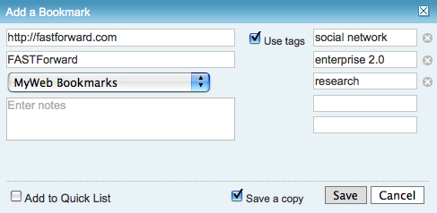
Lastly, the option for input is the text box per tag. This allows for multi-term tags in one text box. Using the tab button on the keyboard after entering a tag the person using this interface will jump down to the next empty text box and have the ability to input a term. I first started seeing this a few years ago in tagging interfaces tools developed in Central Europe and Asia. The Yahoo! Bookmarks 2 UI adopted this in a slightly different implementation than I had seen before, but works much the same (it is shown here).
There are many variations of this type of interface surfacing and are having rather good adoption rates with people unfamiliar to tagging. This approach tied to facets has been deployed in Knowledge Plaza by Whatever s/a and works wonderfully.
All of the benefits of comma delimited multi-term tag interfaces apply, but with the added benefit of having this interface work internationally. International usage not only helps build synonym resources but eases language translation as well, which is particularly helpful for capturing international variance on business or emergent terms.
Summary
This content has come from more than four years of research and discussions with people using tools, both inside enterprise and using consumer web tools. As enterprise moves more quickly toward more cost effective tools for capturing and connecting information, they are aware of not only the value of social tools, but tools that get out the way and allow humans to capture, share, and interact in a manner that is as natural as possible with the tools getting smart, not humans having to adopt technology patterns.
This is a syndicated version of the same post at Optimizing Tagging UI for People & Search :: Personal InfoCloud that has moderated comments available.
"Building the social web" Full-day Workshop in Copenhagen on June 30th
Through the wonderful cosponsoring of FatDUX I am going to be putting on a full-day workshop Building the Social Web on June 30th in Copenhagen, Denmark (the event is actually in Osterbro). This is the Monday following Reboot, where I will be presenting.
I am excited about the workshop as it will be including much of my work from the past nine months on setting social foundations for successful services, both on the web and inside organizations on the intranet. The workshop will help those who are considering, planning, or already working on social sites to improve the success of the services by providing frameworks that help evaluating and guiding the social interactions on the services.
Space is limited for this workshop to 15 seats and after its announcement yesterday there are only 10 seats left as of this moment.
Enterprise 2.0 Boston - After Noah: What to do After the Flood (of Information)
I am looking forward to being at the Enterprise 2.0 Conference in Boston from June 10 to June 12, 2008. I am going to be presenting on June 10, 2008 at 1pm on After Noah: Making Sense of the Flood (of Information). This presentation looks at what to expect with social bookmarking tools inside an organization as they scale and mature. It also looks at how to manage the growth as well as encourage the growth.
Last year at the same Enterprise 2.0 conference I presented on Bottom-up Tagging (the presentation is found at Slideshare, Bottom-up All the Way Down: How Tags Help Businesses Organize, which has had over 8,800 viewing on Slideshare), which was more of a foundation presentation, but many in the audience were already running social bookmarking services in-house or trying them in some manner. This year my presentation is for those with an understanding of what social bookmarking and folksonomy are and are looking for what to expect and how to manage what is happening or will be coming along. I will be covering how to manage heavy growth as well as how to increase adoption so there is heavy usage to manage.
I look forward to seeing you there. Please say hello, if you get a chance.
Enterprise Social Tools: Components for Success
One of the things I continually run across talking with organizations deploying social tools inside their organization is the difficultly getting all the components to mesh. Nearly everybody is having or had a tough time with getting employees and partners to engage with the services, but everybody is finding out it is much more than just the tools that are needed to consider. The tools provide the foundation, but once service types and features are sorted out, it get much tougher. I get frustrated (as do many organizations whom I talk with lately) that social tools and services that make up enterprise 2.0, or whatever people want to call it, are far from the end of the need for getting it right. There is great value in these tools and the cost of the tools is much less than previous generations of enterprise (large organization) offerings.
Social tools require much more than just the tools for their implementation to be successful. Tool selection is tough as no tool is doing everything well and they all are focussing on niche areas. But, as difficult as the tool selection can be, there are three more elements that make up what the a successful deployment of the tools and can be considered part of the tools.
Four Rings of Enterprise Social Tools
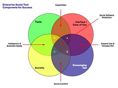 The four elements really have to work together to make for a successful services that people will use and continue to use over time. Yes, I am using a venn diagram for the four rings as it helps point out the overlaps and gaps where the implementations can fall short. The overlaps in the diagram is where the interesting things are happening. A year ago I was running into organizations with self proclaimed success with deployments of social tools (blogs, wikis, social bookmarking, forums, etc.), but as the desire for more than a simple set of blogs (or whichever tool or set of tools was selected) in-house there is a desire for greater use beyond some internal early adopters. This requires paying close attention to the four rings.
Tools
The first ring is rather obvious, it is the tools. The tools come down to functionality and features that are offered, how they are run (OS, rack mount, other software needed, skills needed to keep them running, etc.), how the tools are integrated into the organization (authentication, back-up, etc.), external data services, and the rest of the the usual IT department checklist. The tools get a lot of attention from many analysts and tech evangelists. There is an incredible amount of attention on widgets, feeds, APIs, and elements for user generated contribution. But, the tools do not get you all of the way to a successful implementation. The tools are not a mix and match proposition.
Interface & Ease of Use
One thing that the social software tools from the consumer web have brought is ease of use and simple to understand interfaces. The tools basically get out of the way and bring in more advanced features and functionality as needed. The interface also needs to conform to expectations and understandings inside an organization to handle the flow of interaction. What works for one organization may be difficult for another organization, largely due to the tools and training, and exposure to services outside their organization. Many traditional enterprise tools have been trying to improve the usability and ease of use for their tools over the last 4 to 5 years or so, but those efforts still require massive training and large binders that walk people through the tools. If the people using the tools (not administering the tools need massive amounts of training or large binders for social software the wrong tool has been purchased).
Sociality
Sociality is the area where people manage their sharing of information and their connections to others. Many people make the assumption that social tools focus on everything being shared with everybody, but that is not the reality in organizations. Most organizations have tight boundaries on who can share what with whom, but most of those boundaries get in the way. One of the things I do to help organizations is help them realize what really needs to be private and not shared is often much less than what they regulate. Most people are not really comfortable sharing information with people they do not know, so having comfortable spaces for people to share things is important, but these spaces need to have permeable walls that encourage sharing and opening up when people are sure they are correct with their findings.
Sociality also includes the selective groups people belong to in organizations for project work, research, support, etc. that are normal inside organizations to optimize efficiency. But, where things get really difficult is when groups are working on similar tasks that will benefit from horizontal connections and sharing of information. This horizontal sharing (as well as diagonal sharing) is where the real power of social tools come into play as the vertical channels of traditional organization structures largely serve to make organizations inefficient and lacking intelligence. The real challenge for the tools is the capability to surface the information of relevance from selective groups to other selective groups (or share information more easily out) along the way. Most tools are not to this point yet, largely because customers have not been asking for this (it is a need that comes from use over time) and it can be a difficult problem to solve.
One prime ingredient for social tool use by people is providing a focus on the people using the tools and their needs for managing the information they share and the information from others that flow through the tool. Far too often the tools focus on the value the user generated content has on the system and information, which lacks the focus of why people use the tools over time. People use tools that provide value to them. The personal sociality elements of whom are they following and sharing things with, managing all contributions and activities they personally made in a tool, ease of tracking information they have interest in, and making modifications are all valuable elements for the tools to incorporate. The social tools are not in place just to serve the organization, they must also serve the people using the tools if adoption and long term use important.
Encouraging Use
Encouraging use and engagement with the tools is an area that all organizations find they have a need for at some point and time. Use of these tools and engagement by people in an organization often does not happen easily. Why? Normally, most of the people in the organization do not have a conceptual framework for what the tools do and the value the individuals will derive. The value they people using the tools will derive needs to be brought to the forefront. People also usually need to have it explained that the tools are as simple as they seem. People also need to be reassured that their voice matters and they are encouraged to share what they know (problems, solutions, and observations).
While the egregious actions that happen out on the open web are very rare inside an organization (transparency of who a person is keeps this from happening) there is a need for a community manager and social tool leader. This role highlights how the tools can be used. They are there to help people find value in the tools and provide comfort around understanding how the information is used and how sharing with others is beneficial. Encouraging use takes understanding the tools, interface, sociality, and the organization with its traditions and ways of working.
The Overlaps
The overlaps in the graphic are where things really start to surface with the value and the need for a holistic view. Where two rings over lap the value is easy to see, but where three rings overlap the missing element or element that is deficient is easier to understand its value.
Tools and Interface
Traditional enterprise offerings have focussed on the tools and interface through usability and personalization. But the tools have always been cumbersome and the interfaces are not easy to use. The combination of the tools and interface are the core capabilities that traditionally get considered. The interface is often quite flexible for modification to meet an organizations needs and desires, but the capabilities for the interface need to be there to be flexible. The interface design and interaction needs people who have depth in understanding the broad social and information needs the new tools require, which is going to be different than the consumer web offerings (many of them are not well thought through and do not warrant copying).
Tools and Sociality
Intelligence and business needs are what surface out of the tools capabilities and sociality. Having proper sociality that provides personal tools for managing information flows and sharing with groups as well as everybody as it makes sense to an individual is important. Opening up the sharing as early as possible will help an organization get smarter about itself and within itself. Sociality also include personal use and information management, which far few tools consider. This overlap of tools and sociality is where many tools are needing improvement today.
Interface and Encouraging Use
Good interfaces with easy interaction and general ease of use as well as support for encouraging use are where expanding use of the tools takes place, which in turn improves the return on investment. The ease of use and simple interfaces on combined with guidance that provides conceptual understanding of what these tools do as well as providing understanding that eases fears around using the tools (often people are fearful that what they share will be used against them or their job will go away because they shared what they know, rather than they become more valuable to an organization by sharing as they exhibit expertise). Many people are also unsure of tools that are not overly cumbersome and that get out of the way of putting information in to the tools. This needs explanation and encouragement, which is different than in-depth training sessions.
Sociality and Encouraging Use
The real advantages of social tools come from the combination of getting sociality and encouraging use correct. The sociality component provides the means to interact (or not) as needed. This is provided by the capabilities of the product or products used. This coupled with a person or persons encouraging use that show the value, take away the fears, and provide a common framework for people to think about and use the tools is where social comfort is created. From social comfort people come to rely on the tools and services more as a means to share, connect, and engage with the organization as a whole. The richness of the tools is enabled when these two elements are done well.
The Missing Piece in Overlaps
This section focusses on the graphic and the three-way overlaps (listed by letter: A; B; C; and D). The element missing in the overlap or where that element is deficient is the focus.
Overlap A
This overlap has sociality missing. When the tool, interface, and engagement are solid, but sociality is not done well for an organization there may be strong initial use, but use will often stagnate. This happens because the sharing is not done in a manner that provides comfort or the services are missing a personal management space to hold on to a person's own actions. Tracking one's own actions and the relevant activities of others around the personal actions is essential to engaging socially with the tools, people, and organization. Providing comfortable spaces to work with others is essential. One element of comfort is built from know who the others are whom people are working with, see Elements of Social Software and Selective Sociality and Social Villages (particularly the build order of social software elements) to understand the importance.
Overlap B
This overlap has tools missing, but has sociality, interface, and encouraging use done well. The tools can be deficient as they may not provide needed functionality, features, or may not scale as needed. Often organizations can grow out of a tool as their needs expand or change as people use the tools need more functionality. I have talked with a few organizations that have used tools that provide simple functionality as blogs, wikis, or social bookmarking tools find that as the use of the tools grows the tools do not keep up with the needs. At times the tools have to be heavily modified to provide functionality or additional elements are needed from a different type of tool.
Overlap C
Interface and ease of use is missing, while sociality, tool, and encouraging use are covered well. This is an area where traditional enterprise tools have problems or tools that are built internally often stumble. This scenario often leads to a lot more training or encouraging use. Another downfall is enterprise tools are focussed on having their tools look and interact like consumer social web tools, which often are lacking in solid interaction design and user testing. The use of social tools in-house will often not have broad use of these consumer services so the normal conventions are not understood or are not comfortable. Often the interfaces inside organizations will need to be tested and there many need to be more than one interface and feature set provided for depth of use and match to use perceptions.
Also, what works for one organization, subset of an organization, or reviewer/analyst will not work for others. The understanding of an organization along with user testing and evaluation with a cross section of real people will provide the best understanding of compatibility with interface. Interfaces can also take time to take hold and makes sense. Interfaces that focus on ease of use with more advanced capabilities with in reach, as well as being easily modified for look and interactions that are familiar to an organization can help resolve this.
Overlap D
Encouraging use and providing people to help ease people's engagement is missing in many organizations. This is a task that is often overlooked. The tools, interface, and proper sociality can all be in place, but not having people to help provide a framework to show the value people get from using the tools, easing concerns, giving examples of uses for different roles and needs, and continually showing people success others in an organization have with the social tool offerings is where many organization find they get stuck. The early adopters in an organization may use the tools as will those with some familiarity with the consumer web social services, but that is often a small percentage of an organization.
Summary
All of this is still emergent and early, but these trends and highlights are things I am finding common. The two areas that are toughest to get things right are sociality and encouraging use. Sociality is largely dependent on the tools, finding the limitations in the tools takes a fair amount of testing often to find limitations. Encouraging use is more difficult at the moment as there are relatively few people who understand the tools and the context that organizations bring to the tools, which is quite different from the context of the consumer social web tools. I personally only know of a handful or so of people who really grasp this well enough to be hired. Knowing the "it depends moments" is essential and knowing that use is granular as are the needs of the people in the organization. Often there are more than 10 different use personas if not more that are needed for evaluating tools, interface, sociality, and encouraging use (in some organizations it can be over 20). The tools can be simple, but getting this mix right is not simple, yet.
[Comments are open and moderated at Enterprise Social Tools: Components for Success :: Personal InfoCloud