Off the Top: Information Design Entries
Showing posts: 1-15 of 128 total posts
The Writing Ache
It has been a while since I’ve written here, or over at Personal InfoCloud. I have an even larger stack of things in my writing queue and it is getting to the point that I am aching to write.
Shift Happened
I have a few things I really want to and need to get out. One is to take the Shift Happened series I started and made it through 4 of 16 I have outlined and I am finding the shifts myself and others saw and were living and advising through, happened to far more and they are really lost and acting as if these shifts never happened. Still.
Complexity / Social Lenses
The other thing is my Complexity / Social Lenses are now numbering in the 70s and I need to write to frame the core 12 or so I often use as half-day or full-day workshops to help others see through the fog of complexity with social and other complex environments they work and live within. I have been hoping to get these into a book, but the timing either wasn’t right or the environment (publishing company) shifted.
Information Strata
The last of these is around information depth, which I started relabelling Information Strata, that I have been including in client work and as one of the lenses related to social objects / socially mediated objects (depending if it was Jyri Engstrom or Karin Knor Cetina as one’s entry point). Information strata gets back to the core point and realization in the early 2000s that having a discussion with the subject in clear sight drastically improves the depth of the conversation, reduces errors from lack of clarity or misunderstanding, and improve conversational (information sharing) efficiency. Somehow today that basic concept is really lost and people accept the poor communication patterns as a given or don’t think to investigate a better way.
Over the last 10 years or so I started using a point system around the layers inhibiting a person from having a clear view of what is being discussed. This concept of having a clear understanding and isn’t new, it was something I learned as a communication major in many dog years ago as an undergrad. I need to do a decent write-up of this to have something to point to when helping others. I’m also realizing Info Strata leads right back to the “[Come to Me Web]” and related matters where the importance of bringing things related near has prime importance when building a service and system for someone to live and work with.
Now what I need is time and stability at the same time to get these going. Oh, and to get the ever bumped side project moving forward again.
Khoi Turns Infocards into Wildcard
This past week one of my favorite designers, Khoi Vinh released a product for iOS that is a great play on information card UI called Wildcard. Khoi has a really good write-up of the journey launching Wildcard.
Wildcard is Best When Used
The real joy is in using Wildcard. Khoi created a wonderfully usable and quite intuitive UI and interaction model all based on information cards, which work wonderfully on mobile and other constrained UI devices. Wildcard is a mix of news summary and scrolling service and product finding service.
Information cards are often mis-used and misunderstood. Both Google and Twitter started in with adding infocards to their design and information structuring a few years back. Both did this as a means to surface well chunked and structured content into small chunks for mobile and other UI constrained interfaces, but also for information scanning and lite representation interfaces and interaction models, like Google Now and the Twitter stream. The model does not work as well on fuller information and content sites, as it constrains in ways that are not moving things forwards, but instead setting false arbitrary constraints.
An Interconnected Service
One of the great pleasures in Wildcard is it not only has its own hold onto for later interaction and service, but it has fully integrated sharing with others and into your own services where you track, store, and manage your information nuggets. It does a really good job of integrating into one’s own personal knowledge flows and capture services.
Far too many services (see (unfortunately) Medium as example of current balkanization from other services) have been shifting to make it difficult for the reader and user of their content to work with the content as they wish and need in their information flows. This fracturing means it is more difficult to share and attribute content (and send people to the site) when blogging or other write-ups.
Khoi has long understood the value of information relationships and information flows for use and reuse, which shows brightly here in Wildcard.
Moved Wildcard to the Front Row
After spending about 15 minutes with Wildcard in my first use of it, it moved to the front row of my “News” folder in my iOS devices. It may become one of my first go to apps to see what is happening in the world around me.
A Model Interaction App
One of the things that struck me in my first use was the intuitive interaction model and information model for moving into a collection and around and deeper in the collection and then back out. Wildcard is really well done on this front. It is one of those things where when I am done using it the ease of use (for the most part - there are one or so “wha?” moment, but for a just launched product that is great) really stands out and I start working through how it works and functions. I’m likely going to have a sit down with it not to use it, but to map out what it is doing, because for me its interaction design is really good and fluid.
It is always a joy to find an app or service that not only does its job well and seems to get out of the way, but works to augment your workflows and existing resources for use and reuse. But, when it stands out as a really easy to use service on first use and good for discovery and exploring, it is worth sitting and better understanding the how and why it does that so I can better think through options and paths for things I am working on or advising.
Kudos Khoi!
The Data Journalism Handbook is Available
The Data Journalism Handbook is finally available online and soon as the book Data Journalism Handbook - from Amazon or The Data Journalism Handbook - from O’Reilly, which is quite exciting. Why you ask?
In the October of 2010 the Guardian in the UK posted a Data Journalism How To Guide that was fantastic. This was a great resource not only for data journalists, but for anybody who has interest in finding, gathering, assessing, and doing something with the data that is shared found in the world around us. These skill are not the sort of thing that many of us grew up with nor learned in school, nor are taught in most schools today (that is another giant problem). This tutorial taught me a few things that have been of great benefit and filled in gaps I had in my tool bag that was still mostly rusty and built using the tool set I picked up in the mid-90s in grad school in public policy analysis.
In the Fall of 2011 at MozFest in London many data journalist and others of like mind got together to share their knowledge. Out of this gathering was the realization and starting point for the handbook. Journalists are not typically those who have the deep data skills, but if they can learn (not a huge mound to climb) and have it made sensible and relatively easy in bite sized chunk the journalists will be better off.
All of us can benefit from this book in our own hands. Getting to the basics of how gather and think through data and the questions around it, all the way through how to graphically display that data is incredibly beneficial. I know many people who have contributed to this Handbook and think the world of their contributions. Skimming through the version that is one the web I can quickly see this is going to be an essential reference for all, not just journalists, nor bloggers, but for everybody. This could and likely should be the book used in classes in high schools and university information essentials taught first semester first year.
Traits of Blogs with Highly Valued Content for Me
I was going through my inbound feeds of blogs, news, and articles and catching up on the week. In doing so I open things that are of potential interest in an external browser (as mentioned before in As if Had Read) and realized most have some common traits. Most don't have Twitter feed (most Twitter feeds run at a vastly different information velocity and with very different content areas that distract from the content at hand). As well, many do not have comments on them any more or have moderated comments using built-in commenting service/tool (very rarely is Disqus used).
Strong Content is the Draw
The thing in common is all are focused on the that blog post's content. The content and the focus on the idea at hand is the strength of the attraction.
Some of the blogs are back to their old ways of posting short ideas and things that flow through their lives the want to hold on to, but as also comfortable enough to share out for other's with similar interest.
Ancillary Content Can Easily Distract Attention and Value
Sorting out what the focus of a blog (personal or professional) is essential. The focus is the content and the main pieces on the page. It is good to help keep the focus there without any swirling tag cloud (these seem to be the brunt of the fun poking sticks at conferences these days as they add no value and are completely and utterly unusable, so much so those with the mike continually question what understanding somebody has to add them to their page or site) or any other moving updating object. When talking with readers most say they do not notice these objects, just like web ads have taught us to ignore their blinking and flashing and twirling. As is often said personal sites begin to look like entries in a NASCAR race, where the most anticipated outcomes are the wrecks.
I have seen many attempts at personal homepages and personal aggregation pages, which are of big interest to me (for personal archiving, searching, and review), which are a better place for pulling together the Twitter feed, Flickr, Instagram, Tumblr, etc. Aggregation of this content in a feed option is good too, but keeping the blog page content to a main focus on content is good for the reader and attention on the written word.
Yes, over on the right I have my social bookmarked links. It has been my intention to pull recent items with tags related to content tags, but that has yet to happen.
Social Design for the Enterprise Workshop in Washington, DC Area
I am finally bringing workshop to my home base, the Washington, DC area. I am putting on a my �Social Design for the Enterprise� half-day workshop on the afternoon of July 17th at Viget Labs (register from this prior link).
Yes, it is a Friday in the Summer in Washington, DC area. This is the filter to sort out who really wants to improve what they offer and how successful they want their products and solutions to be.
Past Attendees have Said...
�A few hours and a few hundred dollar saved us tens of thousands, if not well into six figures dollars of value through improving our understanding� (Global insurance company intranet director)
From an in-house workshop�
�We are only an hour in, can we stop? We need to get many more people here to hear this as we have been on the wrong path as an organization� (National consumer service provider)
�Can you let us know when you give this again as we need our [big consulting firm] here, they need to hear that this is the path and focus we need� (Fortune 100 company senior manager for collaboration platforms)
�In the last 15 minutes what you walked us through helped us understand a problem we have had for 2 years and a provided manner to think about it in a way we can finally move forward and solve it� (CEO social tool product company)
Is the Workshop Only for Designers?
No, the workshop is aimed at a broad audience. The focus of the workshop gets beyond the tools� features and functionality to provide understanding of the other elements that make a giant difference in adoption, use, and value derived by people using and the system owners.
The workshop is for user experience designers (information architects, interaction designers, social interaction designers, etc.), developers, product managers, buyers, implementers, and those with social tools running already running.
Not Only for Enterprise
This workshop with address problems for designing social tools for much better adoption in the enterprise (in-house use in business, government, & non-profit), but web facing social tools.
The Workshop will Address�
Designing for social comfort requires understanding how people interact in a non-mediated environment and what realities that we know from that understanding must we include in our design and development for use and adoption of our digital social tools if we want optimal adoption and use.
- Tools do not need to be constrained by accepting the 1-9-90 myth.
- Understanding the social build order and how to use that to identify gaps that need design solutions
- Social comfort as a key component
- Matrix of Perception to better understanding who the use types are and how deeply the use the tool so to build to their needs and delivering much greater value for them, which leads to improved use and adoption
- Using the for elements for enterprise social tool success (as well as web facing) to better understand where and how to focus understanding gaps and needs for improvement.
- Ways user experience design can be implemented to increase adoption, use, and value
- How social design needs are different from Web 2.0 and what Web 2.0 could improve with this understanding
More info...
For more information and registration to to Viget Lab's Social Design for the Enterprise page.
I look forward to seeing you there.
![Reblog this post [with Zemanta]](http://img.zemanta.com/reblog_e.png?x-id�67bb8b-4652-46bc-bc0d-996c1a2d5205)
Catching Up On Personal InfoCloud Blog Posts
Things here are a little quiet as I have been in writing mode as well as pitching new work. I have been blogging work related items over at Personal InfoCloud, but I am likely only going to be posting summaries of those pieces here from now on, rather than the full posts. I am doing this to concentrate work related posts, particularly on a platform that has commenting available. I am still running my own blogging tool here at vanderwal.net I wrote in 2001 and turned off the comments in 2006 after growing tired of dealing comment spam.
The following are recently posted over at Personal InfoCloud
SharePoint 2007: Gateway Drug to Enterprise Social Tools
SharePoint 2007: Gateway Drug to Enterprise Social Tools focusses on the myriad of discussions I have had with clients of mine, potential clients, and others from organizations sharing their views and frustrations with Microsoft SharePoint as a means to bring solid social software into the workplace. This post has been brewing for about two years and is now finally posted.
Optimizing Tagging UI for People & Search
Optimizing Tagging UI for People and Search focuses on the lessons learned and usability research myself and others have done on the various input interfaces for tagging, particularly tagging with using multi-term tags (tags with more than one word). The popular tools have inhibited adoption of tagging with poor tagging interaction design and poor patterns for humans entering tags that make sense to themselves as humans.
LinkedIn: Social Interaction Design Lessons Learned (not to follow)
I have a two part post on LinkedIn's social interaction design. LinkedIn: Social Interaction Design Lessons Learned (not to follow) - 1 of 2 looks at what LinkedIn has done well in the past and had built on top. Many people have expressed the new social interactions on LinkedIn have decreased the value of the service for them.
The second part, LinkedIn: Social Interaction Design Lessons Learned (not to follow) - 2 of 2 looks at the social interaction that has been added to LinkedIn in the last 18 months or so and what lessons have we as users of the service who pay attention to social interaction design have learned. This piece also list ways forward from what is in place currently.
Getting Info into the Field with Extension
This week I was down in Raleigh, North Carolina to speak at National Extension Technology Conference (NETC) 2008, which is for the people running the web and technology components for what used to be the agricultural extension of state universities, but now includes much more. This was a great conference to connect with people trying to bring education, information, and knowledge services to all communities, including those in rural areas where only have dial-up connectivity to get internet access. The subject matter presented is very familiar to many other conferences I attend and present at, but with a slightly different twist, they focus on ease of use and access to information for everybody and not just the relatively early adopters. The real values of light easy to use interfaces that are clear to understand, well structured, easy to load, and include affordance in the initial design consideration is essential.
I sat in on a few sessions, so to help tie my presentation to the audience, but also listen to interest and problems as they compare to the organizations I normally talk to and work with (mid-size member organizations up to very large global enterprise). I sat in on a MOSS discussion. This discussion about Sharepoint was indiscernible from any other type of organization around getting it to work well, licensing, and really clumsy as well as restrictive sociality. The discussion about the templates for different types of interface (blogs and wikis) were the same as they they do not really do or act like the template names. The group seemed to have less frustration with the wiki template, although admitted it was far less than perfect, it did work to some degree with the blog template was a failure (I normally hear both are less than useful and only resemble the tools in name not use). [This still has me thinking Sharepoint is like the entry drug for social software in organizations, it looks and sounds right and cool, but is lacking the desired kick.]
I also sat down with the project leads and developers of an eXtension wide tool that is really interesting to me. It serves the eXtension community and they are really uncoupling the guts of the web tools to ease greater access to relevant information. This flattening of the structures and new ways of accessing information is already proving beneficial to them, but it also has brought up the potential to improve ease some of the transition for those new to the tools. I was able to provide feedback that should provide a good next step. I am looking forward to see that tool and the feedback in the next three to six months as it has incredible potential to ease information use into the hands that really need it. It will also be a good example for how other organizations can benefit from similar approaches.
Comments are open (with usual moderation) at this post at Getting Info into the Field with Extension :: Personal InfoCloud.
YouTube New Interface and Social Interaction Design Santiy Check
YouTube has released a new design for the site and its individual video pages. This gets shared in Google Operating System :: User Inferface Updates at YouTube and TechCrunch :: YouTube Updates Layout, Now with Tabs and Statistics. While the new design looks nice and clean, it has one design bug that is horribly annoying it has mixed interaction design metaphors for its tabs or buttons.
Broken Interaction Design on Buttons or Tabs
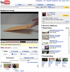 As the image shows the Share, Favorite, Playlists, and Flag buttons or tabs all have similar design treatment, but they do not have the same actions when you click on them. Three of the items (Share, Playlists, and Flag) all act as tabs that open up a larger area below them to provide more options and information. But, the Favorites acts like a button that when clicked it marks the item as a favorite.
This is incredibly poor interaction design as all the items should act in the same manner. If the items do not have the same action properties they really should not look the same and be in the same action space. Favorites should be a check box or a binary interface for on and off. That interaction patter more closely matches the Rate section and seems like it should have been there rather than showing a lack of understanding interaction design basics and confusing people using the site/service.
Social Sites Seem to Share a Lack of Interaction Understanding
This should have been a no brainer observation for a design manager or somebody with a design sanity check. YouTube is far from the the only site/service doing this. Nearly all of the services are not grasping the basics or are broadly applying design patterns to all user scenarios when they really do not fit all scenarios and user types (nearly every service I talk to know exactly the use type a person fits into but never takes this into account in optimization of design patterns that match that use need). Facebook really falls into this hole badly and never seems to grasp they are really making a mess of things the more features and functionality they are bringing into their service without accounting for the design needs in the interface.
My seemingly favorite site to nit pick is LinkedIn which I use a lot and has been a favorite, but their social interaction additions and interactive interfaces really need much better sanity checks and testing before they go into production (even into the beta interface). LinkedIn is really trying to move forward and they are moving in the right direction, but they really need better design thinking with their new features and functionality. Their new design is ready to handle some of the new features, but the features need a lot more refining. The new design shows they have a really good grasp that the interface needs to be a flexible foundation to be used as a framework for including new features, which could benefit from treating them as options for personalization. LinkedIn has pulled back many of the social features and seems to be rethinking them and refining them, but they really need some good sanity checks before rolling them out again.
Social Interaction in Enterprise Tools
The befuddled interaction understanding is not germane to commercial or consumer public social web sites, but it also plagues tools aimed at the enterprise. This is not overly surprising as many of the social enterprise (enterprise 2.0) tools and services are copying the public web tools and services to a large degree. This is a good thing, as it puts the focus on ease of use, which has been horribly missing in business focussed tools for far too long. But, the down side for enterprise focussed tools is they are not for the public web they are for business users, who most often do not have familiarity with the conventions on the public web and they have a large cognitive gap in understanding what the tools do and their value. There is less time for playing and testing in most business people's worklife. This means the tools need to get things right up front with clear understanding of the use needs of the people they are building for in business. This seems to be lacking in many tools as there is much copying of poor design that really needs to be tested thoroughly before launching. Business focussed tools are not hitting the same people as are on the web, which will work through poor design and functionality to see what things do. It is also important to consider that there are a wide variety of types of people using these tools with varying needs and varying interaction understandings (this will be another blog post, actually a series of posts that relate to things I have been including in workshops the last six months and presenting the last couple).
[Comments are available and moderated as usual at: YouTube New Interface and Social Interaction Design Santiy Check :: Personal InfoCloud]
Social Computing Summit in Miami, Florida in April, 2008
ASIS&T has a new event they are putting on this year, the Social Computing Summit in Miami, Florida on April 10-11, 2008 (a reminder page is up at Yahoo's Upcoming - Social Computing Summit). The event is a single-track event on both days with keynote presentations, panels, and discussion.
The opening keynote is by Nancy Baym. I have been helping assist with organization of the Social Computing Summit and was asked by the other organizers to speak, which I am doing on the second day. The conference is a mix of academic, consumer, and business perspectives across social networking, politics, mobile, developing world, research, enterprise, open social networks (social graph and portable social networks) as well as other subjects. The Summit will be a broad view of the digital social world and the current state of understanding from various leaders in social computing.
There is an open call for posters for the event that closes on February 25, 2008. Please submit as this is looking to be a great event and more perspectives and expertise will only make this event more fantastic.
Posting Elements of the Social Software Stack
I have been working for quite on finding a good way to explain the elements in the social software stack (or most of the important ones). I have blogged the result of the work as The Elements in the Social Software Stack (comments are open there).
In my public and in-house workshops I have worked through various graphics from others and my own to work as a foundation for talking to and through the subject. In November I finally sat down (in a hallway open space) the day before my workshop at the IA Konferenz in Stuttgart, Germany. It had all the elements that are part of a solid foundation, in progressive order:
- Identity
- Object (social object)
- Presence
- Actions
- Sharing
- Reputation
- Relationships
- Conversation
- Groups
- Collaboration
This and one other post that is in the works are becoming the corner stones for my work helping start-ups and enterprise work through social software (social computing) to properly solve their problems and address the issues at hand. It has also been the foundation for rethinking (mostly more clearly thinking about) social bookmarking and folksonomy. I am rewriting the work I have done toward the book based on these two pieces as it is making the communication of concepts clearer.
Who Does This Help?
People looking at the social software services should have a solid idea of the central elements, identity and the social object. After that it is a building process to account for the other elements leading up to the services full offerings. Social bookmarking (folksonomy related services) should get up to or include conversation. Tools like Ma.gnolia go up to groups for their social bookmarking service and they cover the elements leading up to that end point.
There is more that can be fleshed out in this, but it is a foundation and a starting point. The next piece will build on this posting and should be a good foundation for understanding.
Still here? Go read The Elements in the Social Software Stack :: Personal InfoCloud and offer constructive feedback. Thank you.
Can Facebook Change Its DNA
I wrote and posted Can Facebook Change Its DNA as a follow-up to for Business or LinkedIn Gets More Valuable regarding the changes needed in Facebook if it wants to be valuable (or have optimal value) for the business world.
The State of Enterprise Social Software - Pointer
I have written and posted The State of Enterprise Social Software on my Peronal InfoCloud blog as it has comments on and it also is where I am trying to keep my more professional pieces.
This blog post is a reaction to Richard McManus excellent post Big Vendors Scrap for Enterprise 2.0 Supremacy. The post seemed less about supremacy than scapping to be relevant. Many of the tools I am quite or somewhat familiar with and rather unimpressed. But, go read the other post to find my assessments of the tools, but also the tools that are doing much better jobs than the traditional enterprise vendors.
Reading Information and Patterns
The past few weeks and months the subject of reading, analysis, and visualization have been coming up a lot in my talking and chatting with people. These are not new subjects for me as they are long time passions. Part of the discussion the past few weeks have been focussed on what is missing in social bookmarking tools (particularly as one's own bookmarks and tags grows and as the whole service scales) as wells as group discussion monitoring tools, but this discussion is not the focus of this post. The focus is on reading, understanding, and synthesis of information and knowledge.
Not that Reading
I really want to focus on reading. Not exactly reading words, but reading patterns and recognizing patterns and flows to get understanding. After we learn to read a group of letters as a word we start seeing that group of letters as a shape, which is a word. It is this understanding of patterns that interact and are strung together that form the type of reading I have interest in.
Yesterday, Jon Udell posted about analyzing two gymnasts make turns. He was frustrated that the analysis on television lacked good insight (Jon is a former gymnast). Jon, who is fantastic at showing and explaining technologies and interactions to get to the core values and benefits as well as demoing needed directions, applied his great skill and craft on gymnastics. He took two different gymnasts doing the same or similar maneuver frame-by-frame. Jon knew how to read what each gymnast was doing and shared his understanding of how to read the differences.
Similarly a week or so ago an article about the Bloomberg Terminal fantasy redesign along with the high-level explanations and examples of the Bloomberg Terminal brought to mind a similar kind of reading. I have a few friends and acquaintances that live their work life in front of Bloomberg Terminals. The terminals are an incredible flood of information and views all in a very DOS-looking interface. There is a skill and craft in not only understanding the information in the Bloomberg Terminal, but also in learning to read the terminal. One friend I chatted with while he was working (years ago) would glance at the terminal every minute. I had him explain his glancing, which essentially was looking for color shifts in certain parts of the screen and then look for movement of lines and characters in other areas. He just scanned the screen to look for action or alerts. His initial pass was triage to then discern where to focus and possibly dive deeper or pivot for more related information.
The many of the redesign elements of the Bloomberg Terminals understood the reading and ability to understand vast information (in text) or augmented the interface with visualizations that used a treemap (most market analysts are very familiar with the visualization thanks to SmartMoney's useage). But, the Ziba design was sparse. To me it seemed like many of the market knowledge workers used to the Bloomberg Terminal and knew how to read it would wonder where their information had gone.
Simplicity and Reading with Experience
The Ziba solution's simplicity triggers the need in understanding the balance between simplicity just breaking down the complex into smaller easy to understand bits and growing into understanding the bits recollected in a format that is usable through recognition and learned reading skills. The ability to read patterns is learned in many areas of life in sport, craft, and work. Surfers look at the ocean waves and see something very different from those who do not surf in the ebb, flow, breaks, surface currents and under currents. Musicians not only read printed music but also hear music differently from non-musicians, but formally trained musicians read patterns differently from those who have just "picked it up". There has been a push in business toward data dashboards for many years, but most require having the right metrics and good data, as well as good visualizations. The dashboards are an attempt to provide reading information and data with an easier learning curve through visualization and a decreased reliance on deep knowledge.
Getting Somewhere with Reading Patterns
Where this leads it there is a real need in understanding the balance between simplicity and advanced interaction with reading patterns. There is also a need to understand what patterns are already there and how people read them, including when to adhere to these patterns and when to break them. When breaking the patterns there needs to be simple means of learning these new patterns to be read and providing the ability to show improved value from these new patterns. This education process can be short video screen shots, short how-to use the interface or interactions. Building pattern libraries is really helpful.
Next, identify good patterns that are available and understand why they work, particularly why they work for the people that use then and learn how people read them and get different information and understanding through reading the same interface differently. Look at what does not work and where improved tools are needed. Understand what information is really needed for people who are interested in the information and data.
 An example of this is Facebook, which has a really good home page for each Facebook member, it is a great digital lifestream of what my friends are doing. It is so much better at expressing flow and actions the people I have stated I have social interest in on Facebook than any other social web tool that came before Facebook. Relative to the individual level, Facebook fails with its interface of the information streams for its groups. Much of the content that is of interest in Facebook happens in the groups, but all the groups tell you is the number of new members, new messages, new videos, and new wall posts. There is much more valuable information tucked in there, such as who has commented that I normally interact with, state the threads that I have participated in that have been recently updated, etc.
This example illustrates there needs to be information to read that has value and could tell a story. Are the right bits of information available that will aid understanding of the underlying data and stories? It the interface helpful? Is it easy to use and can it provide more advanced understanding? Are there easy to find lessons in how to read the interface to get the most information out of it?
Why Ma.gnolia is One of My Favorite Social Bookmarking Tools
After starting the Portable Social Network Group in Ma.gnolia yesterday I received a few e-mails and IMs regarding my choice. Most of the questions were why not just use tags and del.icio.us. After I posted my Ma.Del Tagging Bookmarklet post I have had a lot of questions about Ma.gnolia and my preference as well as people thought I was not a fan of it. I have been thinking I would blog about my usage, but given my work advising on social bookmarking and social web, I shy away talking about what I use as what I like is likely not what is going to be a good fit for others. But, my work is one of the reasons I want to talk about what I like using as nearly every customer of mine and many presentation attendees look at del.icio.us first (it kicked the door wide open with a tool that was light years ahead of all others), but it is not for everybody and there are many other options. Much of my work is with enterprise and organizations of various size, which del.icio.us is not right for them for privacy reasons. I still add to del.icio.us along with my favorite as there are many people that have subscribed to the at feed as they derive value from that subscription so I take the extra step to keep that feed as current.
Ma.gnolia Offers Great Features for Sociality
I have two favorite tools for my own personal social bookmarking reasons Ma.gnolia and Clipmarks (I don't think I have anything publicly shared in Clipmarks). First the later, I use Clipmarks primarily when I only want to bookmark a sub-page element out on the web, which are paragraphs, sentences, quotes, images, etc.
I moved to try Ma.gnolia again last Fall when something changed in del.icio.us search and the results were not returning things that were in del.icio.us. My trying Ma.gnolia, by importing all of my 2200 plus bookmarks not only allowed me to search and find things I wanted, but I quickly became a fan of their many social features. In the past year or less they have become more social in insanely helpful and kind ways. Not only does Ma.gnolia have groups that you can share bookmarks with but there is the ability to have discussions around the subject in those groups. Sharing with a group is insanely easy. Groups can be private if the manager wishes, which makes it a good test ground for businesses or other organizations to test the social bookmarking waters. I was not a huge fan of rating bookmarks as if I bookmarked something I am wanting to refind it, but in a more social context is has value for others to see the strength of my interest (normall 3 to 5 stars). One of my favorite social features is giving "thanks", which is not a trigger for social gaming like Digg, but is an interpersonal expression of appreciation that really makes Ma.gnolia a friendly and positive social environment.
Started with Beauty, but Now with Ease
Ma.gnolia started as a beautiful del.icio.us (it was not the first) and the beauty got in the way of usability for many. But, Ma.gnolia has kept the beautiful strains and added simple ease of use in a very Apple delightful moments sort of way. The thanks are a nice treat, but the latest interactions that provide non-disruptive ease of use to accomplish a task, without completely taking you away from your previous flow (freaking brilliant in my viewpoint - anything that preserves flow to accomplish a short task is a great step). Another killer feature is Ma.gnolia Roots, which is a bookmarklet that when clicked hovers a semi-transparent layer over the webpage to show information from Ma.gnolia about that page (who has linked to it, tags, annotations, etc.) and makes it really easy to bookmark that page from that screen. The API (including a replica of the del.icio.us API that nearly all services use as the standard), add-ons, Creative Commons license for your bookmarks, many bookmarklet options, and feed options. But, there are also the little things that are not usually seen or noticed, such as great URLs that can be easily parsed, all pages are properly marked up semantically, and Microformats are broadly and properly used throughout the site (nearly at every pivot).
Intelligently Designed
For me Ma.gnolia is not only a great site to look at, a great social bookmarking site that is really social (as well as polite and respectful of my wishes), but a great example for semantic web mark-up (including microformats). There is so much attention to detail in the page markup that for those of us that care it is amazingly beautiful. The visual layer can be optimized for more white space and detail or for much easier scrolling. The interactions, ease of use, and delightful moments that assist you rather than taking you out of your flow (workflow, taskflow, etc.) and make you ask why all applications and social sites are not this wonderful.
Ma.gnolia is not perfect as it needs some tools to better manage and bulk edit your own bookmarks. It could use a sort on search items (as well as narrow by date range). Search could use some RedBull at times. It could improve with filtering by using co-occurance of tag terms as well as for disambiguation.
Overall for me personally, Ma.gnolia is a tool I absolutely love. It took the basic social bookmarking idea in del.icio.us and really made it social. It has added features and functionality that are very helpful and well executed. It is an utter pleasure to use. I can not only share things easily and get the wonderful effects of social interaction, but I can refind things in my now 2,500 plus bookmarks rather easily.
Sharing and Following/Listening in the Social Web
You may be familiar with my granular social network post and the postings around the Personal InfoCloud posts that get to personal privacy and personal management of information we have seen, along with the Come to Me Web, but there is an element that is still missing and few social web sites actually grasp the concept. This concept is granular in the way that the granular social network is granular, which focusses on moving away from the concept of "broad line friends" that focus on our interest in everything people we "friend", which is not a close approximation of the non-digital world of friend that we are lucky to find friends who have 80 percent common interests. This bit that is missing focusses on the sharing and following (or listening) aspects of our digital relationships. Getting closer to this will help filter information we receive and share to ease the overflow of information and make the services far more valuable to the people using them.
Twitter Shows Understanding
Twitter in its latest modifications is beginning to show that it is grasping what we are doing online is not befriending people or claiming friend, but we are "following" people. This is a nice change, but it is only part of the equation that has a few more variables to it, which I have now been presenting for quite a few years (yes and am finally getting around to writing about). The other variables are the sharing and rough facets of type of information we share. When we start breaking this down we can start understanding the basic foundation for building a social web application that can begin to be functional for our spheres of sociality.
Spheres of Sociality
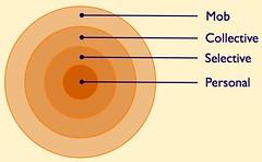 The Spheres of Sociality are broken into four concentric rings:
- Personal
- Selective
- Collective
- Mob
There are echos of James Surowiecki's Wisdom of Crowds in the Spheres of Sociality as they break down as follows. The personal sphere is information that is just for one's self and it is not shared with others. The selective sphere, which there may be many a person shares with and listens to, are closed groups that people are comfortable sharing and participating with on common interests (family, small work projects, small group of friends or colleagues, etc.). The collective sphere is everybody using that social tool that are members of it, which has some common (precise or vague) understanding of what that service/site is about. The last sphere is the mob, which are those people outside the service and are not participants and who likely do not understand the workings or terminology of the service.
These sphere help us understand how people interact in real life as well as in these social environments. Many of the social web tools have elements of some of these or all of these spheres. Few social web tools provide the ability to have many selective spheres, but this is a need inside most enterprise and corporate sites as there are often small project teams working on things that may or may not come to fruition (this will be a future blog post). Many services allow for just sharing with those you grant to be your followers (like Twitter, Flickr, the old Yahoo! MyWeb 2.0, and Ma.gnolia private groups, etc.). This selective and segmented group of friends needs a little more examination and a little more understanding.
Granular Sharing and Following
 The concepts that are needed to improve upon what has already been set in the Spheres of Sociality revolve around breaking down sharing and following (listening) into more discernible chunks that better reflect our interests. We need to do this because we do not always want to listen everything people we are willing to share with are surfacing. But, the converse is also true we may not want to share or need to share everything with people we want to follow (listen to).
In addition to each relationship needing to have sharing and listening properties, the broad brush painted by sharing and listening also needs to be broken down just a little (it could and should be quite granular should people want to reflect their real interests in their relationships) to some core facets. The core facets should have the ability to share and listen based on location, e.g. a person may only want to share or listen to people when they are in or near their location (keeping in mind people's location often changes, particularly for those that travel or move often). The location facet is likely the most requested tool particularly for those listening when people talk about Twitter and Facebook. Having some granular categories or tags to use as filters for sharing and listening makes sense as well. This can break down to simple elements like work, play, family, travel, etc. as broad categories it could help filter items from the sharing or listening streams and help bring to focus that which is of interest.
Breaking Down Listening and Sharing for Items
| Yourself | Others | |
|---|---|---|
| Share | Yes | Yes/No |
Where this gets us it to an ability to quickly flag the importance of our interactions with others with whom we share information/objects. Some things we can set on an item level, like sharing or just for self, and if sharing with what parameters are we sharing things. We will set the default sharing with ourself on so we have access to everything we do. This follows the Spheres of Sociality with just personal use, sharing with selective groups (which ones), share with the collective group or service, and share outside the service. That starts setting privacy of information that starts accounting for personal and work information and who could see it. Various services have different levels of this, but it is a rare consumer services that has the selective service sorted out (Pownce comes close with the options for granularity, but Flickr has the ease of use and levels of access. For each item we share we should have the ability to control access to that item, to just self or out across the Spheres of Sociality to the mob, if we so wish. Now we can get beyond the item level to presetting people with normative rights.
Listening and Sharing at the Person Level
| Others Settings | ||
|---|---|---|
| Listen/Follow | Yes | No |
| Granular Listen/Follow | Yes | No |
| Granular Share | Yes | No |
| Geo Listen/Follow | Yes | No |
| Geo Share | Yes | No |
We can set people with properties that will help use with default Sphere of Sociality for sharing and listening. The two directions of communication really must be broken out as there are some people we do not mind them listening to the selective information sharing, but we may not have interest in listening to their normal flow of offerings (optimally we should be able to hear their responses when they are commenting on items we share). Conversely, there may be people we want to listen to and we do not want to share with, as we may not know them well enough to share or they may have broken our privacy considerations in the past, hence we do not trust them. For various reasons we need to be able to decide on a person level if we want to share and listen to that person.
Granular Listening and Sharing
Not, only do we have needs and desires for filtering what we share and listen to on the person level, but if we have a means to set some more granular levels of sharing, even at a high level (family, work, personal relation, acquaintance, etc.). If we can set some of these facets for sharing and have them tied to the Spheres we can easily control who and what we share and listen to. Flickr does this quite well with the simple family, friends, contacts, and all buckets, even if people do not use them precisely as such as family and friends are the two selective buckets they offer to work with (most people I know do not uses them precisely as such with those titles, but it provides a means of selective sharing and listening).
Geo Listening and Sharing
Lastly, it is often a request to filter listening and sharing by geography/location access. There are people who travel quite a bit and want to listen and share with people that are currently local or will be local to them in a short period, but their normal conversations are not fully relevant outside that location. Many people want the ability not to listen to a person unless they are local, but when a person who has some relationship becomes local the conversation may want to be shared and/or listened to. These settings can be dependent on the granular listening and sharing parameters, or may be different.
Getting There...
So, now that this is out there it is done? Hmmm, if it were only so easy. The first step is getting developers of social web and social software to begin understanding the social relationships that are less broad lines and more granular and directional. The next step is a social interaction that people need to understand or that the people building the interfaces need to understand, which is if and how to tell people the rights granted are not reciprocal (it is seems to be a common human trait to have angst over non-reciprocal social interactions, but it is the digital realm that makes it more apparent that the flesh world).