Off the Top: Web Entries
Showing posts: 121-135 of 232 total posts
Explaining and Showing Broad and Narrow Folksonomies
I have been explaining the broad and narrow folksonomy in e-mail and in comments on others sites, as well as in the media (Wired News). There has still been some confusion, which is very understandable as it is a different concept that goes beyond a simple understanding of tagging. I have put together a couple graphics that should help provide a means to make this distinction some what clearer. The folksonomy is a means for people to tag objects (web pages, photos, videos, podcasts, etc., essentially anything that is internet addressable) using their own vocabulary so that it is easy for them to refind that information again. The folksonomy is most often also social so that others that use the same vocabulary will be able to find the object as well. It is important to note that folksonomies work best when the tags used to describe objects are in the common vocabulary and not what a person perceives others will call it (the tool works like no other for personal information management of information on the web, but is also shared with the world to help others find the information).
Broad Folksonomy
Let's begin with the broad folksonomy, as a tool like del.icio.us delivers. The broad folksonomy has many people tagging the same object and every person can tag the object with their own tags in their own vocabulary. This lends itself very easy to applying the power law curve (power curve) and/or net effect to the results of many people tagging. The power terms and the long tail both work.
The broad folksonomy is illustrated as follows. 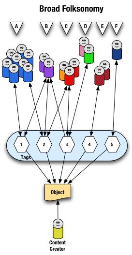
From a high level we see a person creates the object (content) and makes it accessible to others. Other people (groups of people with the same vocabulary represented people blobs and noted with alphabet letters) tag the object (lines with arrows pointing away from the people) with their own terms (represented by numbers). The people also find the information (arrows on lines pointing from the numeric tags back to the people blobs) based on the tags.
Digging a little deeper we see quite a few people (8 people) in group "A" and they have tagged the object with a "1" and a "2" and they use this term to find the object again. Group "B" (2 people) have applied tag "1" and "2" to the object and they use tag terms "1", "2", and "3" to find the information. Group "C" (3 people) have tagged the object with "2" and "3" so that they can find the object. Group "D" has also tagged the object with tag "3" so that they may refind the information this group may have benefitted from the tagging that group "C" provided to help them find the information in the first place. Group "E" (2 people) uses a different term, "4", to tag the object than others before it and uses only this term to find the object. Lastly, group "F" (1 person) uses tag "5" on the object so that they may find it.
Broad Folksonomy and the Power Curve
The broad folksonomy provides a means to see trends in how a broad range are tagging one object. This is an opportunity to see the power law curve at work and show the long-tail.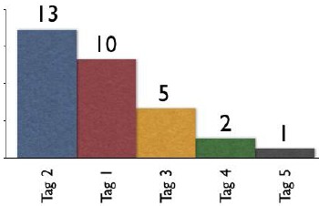
The tags spike with tag "2" getting the largest portion of the tags with 13 entries and tag "1" receiving 10 identical tags. From this point the trends for popular tags are easy to see with the spikes on the left that there are some trends, based on only those that have tagged this object, that could be used extract a controlled vocabulary or at least know what to call the object to have a broad spectrum of people (similar to those that tagged the object, and keep in mind those that tag may not be representative of the whole). We also see those tags out at the right end of the curve, known as the long tail. This is where there is a small minority of people who call the object by a term, but those people tagging this object would allow others with a similar vocabulary mindset to find the object, even if they do not use the terms used by the masses over at the left end of the curve. If we take this example and spread it out over 400 or 1,000 people tagging the same object we will se a similar distribution with even more pronounced spikes and drop-off and a longer tail.
This long tail and power curve are benefits of the broad folksonomy. As we will see the narrow folksonomy does not have the same properties, but it will have benefits. These benefits are non-existent for those just simply tagging items, most often done by the content creator for their own content, as is the means Technorati has done, even with their following tag links to destinations other than Technorati (as they initially had laid out). The benefits of the long tail and power curve come from the richness provided by many people openly tagging the same object.
Narrow Folksonomy
The narrow folksonomy, which a tool like Flickr represents, provides benefit in tagging objects that are not easily searchable or have no other means of using text to describe or find the object. The narrow folksonomy is done by one or a few people providing tags that the person uses to get back to that information. The tags, unlike in the broad folksonomy, are singular in nature (only one tag with the term is used as compared to 13 people in the broad folksonomy using the same tag). Often in the narrow folksonomy the person creating the object is providing one or more of the tags to get things started. The goals and uses of the narrow folksonomy are different than the broad, but still very helpful as more than one person can describe the one object. In the narrow the tags are directly associated with the object. Also with the narrow there is little way of really knowing how the tags are consumed or what portion of the people using the object would call it what, therefore it is not quite as helpful as finding emerging vocabulary or emergent descriptions. We do find that tags used to describe are also used for grouping, which is particularly visible and relevant in Flickr (this is also done in broad folksonomies, but currently not to the degree of visibility that it is done on Flickr, which may be part of the killer interactive environment Ludicorp has created for Flickr).
The narrow folksonomy is illustrated as follows.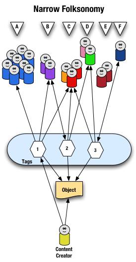
From a high level we see a person creates the object and applies a tag ("1") that represents what they call the object or believe describes the object. There are fewer tags provided than in a broad folksonomy and there is only one of each tag applied to the object. The consumers of the object also can apply tags that help them find the object or describe what they believe are the terms used to describe this object.
A closer look at the interaction between people and the object and tags in a narrow folksonomy shows us that group "A" uses tag "1" to find and come back to the object (did the creator do this on purpose? or did she just tag it with what was helpful to her). We see group "B" also using tag "1" to find the object, but they have tagged the object with tag "2" to also use as a means to find the object. Group "C" uses tag "1","2", and "3" to find the object and we also note this group did not apply any of its own tags to the object as so is only a consumer of the existing folksonomy. We see group "D" uses tags "2" and "3" to find the objects and it too does not add any tags. Group "E" is not able to find the object by using tags as the vocabulary it is using does not match any of the tags currently provided. Lastly, group "F" has their own tag for the object that they alone use to get back to the object. Group "F" did not find the object through existing tags, but may have found the object through other means, like a friend e-mailed them a link or the object was included in a group they subscribe to in their feed aggregator.
We see that the richness of the broad folksonomy is not quite there in a narrow folksonomy, but the folksonomy does add quite a bit of value. The value, as in the case of Flickr, is in text tags being applied to objects that were not findable using search or other text related tools that comprise much of how we find things on the internet today. The narrow folksonomy does provide various audiences the means to add tags in their own vocabulary that will help them and those like them to find the objects at a later time. We are much better off with folksonomies than we were with out them, even if it is a narrow folksonomy being used.
Conclusion
We benefit from folksonomies as the both the personal vocabulary and the social aspects help people to find and retain a tether to objects on the web that are an interest to them. Who is doing the tagging is important to understand and how the tags are consumed is an important factor. This also helps us see that not all tagging is a folksonomy, but is just tagging. Tagging in and of its self is a helpful step up from no tagging, but is no where near as beneficial as opening the tagging to all. Folksonomy tagging can provide connections across cultures and disciplines (an knowledge management consultant can find valuable information from an information architect because one object is tagged by both communities using their own differing terms of practice). Folksonomy tagging also makes up for missing terms in a site's own categorization system/taxonomy. This hopefully has made things a little clearer for all in our understanding the types of folksonomies and tagging and the benefits that can be derived.
This entry first appeared at Personal InfoCloud and comments are open for your use there.
The Future of Newspapers
A state of the newspaper industry article in today's Washington Post tries to define what people want from newspapers and what people are doing to get information.
Me? I find that newspapers provide decent to great content. Newspapers are losing readers of their print versions, but most people I know are new reading more than one paper, but online. The solutions I see from my vantage are as follows.
Ads
The articles rarely have ads that relate to the stories, foolishly missing ad revenues. The ads that are available are distracting and make for an extremely poor experience for the reader. News sites should ban the improperly targeted inducements that rely on distracting from reading the article, which is the reason the person is on that web page. The person has an interest in the topic. There are monetary opportunities to be had if the news outlets were smart and advertisers were smart.
How? If I am reading an article on the San Francisco Giants I would follow and may pay a little something for an ad targeted to this interest of mine. I like to buying Giants tickets, paraphernalia, a downloadable video of the week's highlights, etc. If I am reading about an airline strike a link to train tickets would be a smart option. A news article about problems in the Middle East could have links to books by the journalist on the subject, other background books or papers, links to charitable organizations that provide support in the region. The reader has shown an interest, why not offer something that will also be of interest?
We know that advertisers want placement in what they consider prime territory, the highly trafficked areas of the site. Often this is when the non-targeted ads appear. This is an opportunity to have non-targeted ads pay a premium, say five to 20 times that of targeted ads. The non-targeted ads have to follow the same non-disruptive guidelines that targeted ads follow. This is about keeping the readers around, without readers selling ads does not make any sense.
Archives
One area the news site are driving me crazy is access to the archives. The news sites that require payment to view articles in the archives are shooting themselves in the foot with this payment method and amount required to cough up to see an article that may or may not be what the person interested is seeking. The archives have the same opportunity to sell related ads, which in my non-professional view, would seem like they would have more value as the person consuming the information has even more of an interest as they are more than a casual reader. Any payment by the person consuming the information should never be more than the price for the whole print version. The articles cost next to nothing to store and the lower the price the more people will be coming across the associated advertising.
Blogging and personal sites often point to news articles. Many of us choose whom we are going to point to based on our reader's access to that information at any point in the future. We may choose a less well written article, but knowing it will be around with out having to pay extortionist rates to see it is what many of us choose. Yes, we are that smart and we are not as dumb as your advertisers are telling you. We, the personal site writers are driving potential ad revenues to you for free, if you open your articles for consumption.
Loyalty
Loyalty to one paper is dead, particularly when there are many options to choose to get our news from. We can choose any news source anywhere in the world. Why would we choose yours? Easy access, good writing, point of view, segment coverage (special interests - local, niche industries, etc), etc. are what drive our decisions.
I often choose to make my news selections to include sources from outside my region and even outside my country. Why? I like the educated writing style that British sources offer. I like other viewpoints that are not too close to the source to be tainted. I like well researched articles. I like non-pandering viewpoints. This is why I shell out the bucks for the Economist, as it is far better writing than any other news weekly in the U.S. and it pays attention to what is happening around the world, which eventually will have an impact to me personally at some point in the future. I don't have patience for mediocrity in journalism and the standards for many news sources have really slipped over the past few years.
News sources should offer diversity of writing style and opinion of one source will attract attention. The dumbing down of writing in the news has actually driven away many of those that are willing to pay to read the print versions. Under educated readers are not going to pay to read, even if it is dumbed down. Yes, the USA Today succeeded in that, but did you really want those readers at the loss of your loyal revenue streams?
Loyalty also requires making the content available easily across devices. Time and information consumption has changed. We may start reading an article in the print edition (even over somebody's shoulder and want to follow-up with it. We should be able to easily find that article online at our desk or from our mobile device. Integration of access across devices is a need not a nicety and it is not that difficult to provide, if some preparation is done with the systems. Many of us will pull RSS feeds from our favorite news sources and flag things for later consumption, but the news sites have not caught on how to best enable that. We may pull feeds at one location, but may have the time and focus to read them at another location, but we may not have the feeds there. Help those of us that are loyal consume your information in a pan-medium and pan-device world that we live in.
Information Waste is Rampant
Fast Company published costs facing business. The top four relate to poor design and information use: Poor knowledge harnessing ($1.4 Trillion); Digital publishing inefficiencies ($750 billion); Data quality problems ($600 billion); and Paper-based trade processes ($400 billion). That is 3.15 Trillion U.S. dollars down the tubes with no benefit.
The solutions are not that difficult, but everybody seems happy to use the rear view mirror to view the future.
Christina stated, "What me worry" about design and business. The whole CIO is a sham as the CIO is a technology driven person, which is tangentially related to information and technology still hinders information flow if not planned for properly (more on this is coming in the near future here on this site). There needs to be a chief level position that cares about the information, the people using it, and the people who create the information. To Christina's post I responded with the following on her site (posted here so I can better keep track of it):
It seems like the 80s all over again. The focus on design in the to late 80s, mostly with unified branding and creative practices formally brought in-house. There was a lot of push around design, mostly labelled branding (nearly the exact same discussions, but slightly different terms). Much of this was around the brandhouses like Landor. The business community embraced the results and tried to incorporate the creative culture as part of their own.
What happened? The innovators were bought by large advertising or public relation firms and the firms changed their industry term to communication companies. Companies created corporate communication divisions (comprised of adversising, PR, branding, and other creative endevors) and had high level management visability.
By the early 90s the corporate environment had largely subsumed the communication into marketing and business schools that has embraced the creative mindset followed suit. Today marketing is often what trumps design and there is no creative in marketing. The creative departments by the late 90s had been gutted by the web craze. This left business types with little creative craft understanding as those driving what was once good.
It is not suprising that currently named "design" is taking off, as what was good about the creative was gutted and most companies lack central design plans. There is tremendous waste in cross medium design, as few sites are built with an understanding of the digital medium, let alone cross platform design or true cross media design. Part of the problem is far too few designers actually understand cross-platform and/or cross-media design. There is millions wasted in bandwidth on poor web design that is using best practices from the late 90s not those from today. There is no integration of mobile, with a few exceptions in the travel industry. There is still heavy focus on print, but very little smart integration of design in the digital medium. This even applies to AIGA, which is a great offender of applying print design techniques on the web. How can we expect business design to get better if one of the pillars of the design profession has not seemed to catch on?
There are large problems today and we need to break some of our solutions were have been trying to get to solutions that work. Not only do today's solutions not work today, they will not work tomorrow as they are only stop gaps. Cross-platform, cross-device, and cross-medium design solutions are needed, but technology is not here to deliver and few that I have run across in the design world are ready for that change as they have not made the change to today's world.
Today's designer focusses on getting the information in front of the user and stops there. They do not consider how this person or machine may reuse the information. There is so much yet to improve and yet the world is progressing much faster than people can or want to change to keep up. There are designers and developers who will not build for mobile (it is not that hard to do) because they do not see them in the user logs. They fail to see the correlation that their sites suck for mobile and mobile users may test once and go somewhere else for their information. The people that are seeing mobile users in their logs are the ones that have figured out how to design and develop for them properly (most have found that it is relatively inexpensive to do this). This is not rocket science, it is using something other than the rear view mirror to design for now and the future.
Fix Your Titles for Better Search and Use
Lose the ego already! Since I have been using del.icio.us I have been noticing how backwards so many site's header titles are these days. The header title should be specific to general information.
You are saying "huh?" Okay, take CNN who uses the header title like <title>CNN.com - Dog Bites Man</title>. The better way is <title>Dog Bites Man - CNN.com</title>.
Why? Search engines, browser headers, and bookmarks are why. Search engines use the words to give preference and the words closer to the beginning have higher preference. A browser header will only show the first so many letters (depending on the browser and how wide the browser window is open). Lastly the title is used in browser bookmarks. If a person has four bookmarks to items in a site they would see the site name and then the bit that is important to the user.
Now look at the pages you build are they built for search engines and for people to actually use and come back to? It may be your site management tools that have mangled your titles and they need to be fixed, but they will not be fixed if you do not ask. The other reason titles are broken is because somebody who does not understand the web want only to have their ego stroked, but they made their information less valuable by doing so.
Ninth Anniversary for My Personal Site
At some point nine years ago I began my first personal site. It was November 1995 and CompuServ opened up space for their users to publish their own site. This trek began with creating a page using a text browser and some prefab components from CompuServ. The computer this adventure began with is long gone. But, the remnants of the site remain, mostly in the links page, which became my bookmarks that I could access from anywhere. I never really went back to using browser based bookmarks after this point.
My personal site has changed over the years, from a site that was named the "Growing Place" that housed poetry, links, a snippet about consulting work I was doing, and a homepage. Version 2 was a move off of CompuServ to Clark.net hosting (which became Verio and was never the same after) came with frames and FrontPage buttons (the buttons never worked right after they were edited) and the links page grew and the consulting page moved from active to "under construction". V.2 also had some CGI form pages, mostly for mail and a guestbook that was not linked.
Version 3 (about 1998) was a move to vanderwal.net and had a black background with electric green and electric blue text. V.3 provided more links and had a small page of annotated links that was updated infrequently, and was mostly short notes to myself and was not linked to by anything but referrer logs. V.3 began using ColdFusion and then ASP, as that was what I was playing with at the time. This version was hosted at Interland, which was not a favorite ISP as I was doing bug fixing for them and their poor system administration.
Version 4 (November 2000) was moved to an ISP with PHP. This was just after our wedding and a photo gallery was born. The site stayed in black with blue and green for a short while, until it moved to a blue and orange theme (April 2001) inspired by the trip to the mother country Holland on our honeymoon. The annotated links were still being kept by hand, but were linked to finally. December 2000 I started using Blogger, which made the annotated links easier and provided a spark to post other information.
We are still in Version 4, possibly in version 5 as the graphic design morphed in November 2003 to its current state. This design validated to XHTML and made maintenance much easier. Off the Top weblog was converted to PHP in October 2001 after leaving Blogger and hand maintaining this section for months. The hosting has remained the same and has been steady.
There are many things in the works, but other outside commitments have been putting things on hold. The markup and CSS need to be cleaned up for greater ease. There are some hosting modifications coming, which could trigger some more changes on the back end programming side. There are some design and presentational structure changes that are being played with as there are a few things that really bug me. I really want the comments back online and I have plan for this, but it needs some time to work out the details. There are some changes external to this site that could be coming also, which will make things much easier in the long run. Maybe these revisions will be done by the 10th anniversary.
Web 2.0: Source, Container, Presentation
At Web 2.0 Jeff Bezos, of Amazon stated, "Web 2.0 is different. It's about AWS (Amazon Web Services). It's not on the web site for users to see. It's about making the internet useful for computers.". This is very appropriate today as it breaks the information model into at least three pieces: source, container, and presentation. Web 1.0 often had these three elements in one place, which really made it difficult to reuse the information, but even use it at times.
The source is the raw information or content from the creator or main distributor. The container is the means of transporting the information or content. The container can be XML, CSV, text, XHTML, etc. The presentation is what is used to make the information or content human consumable. The presentation can be HTML with CSS, Flash, PDF, feed reader, mobile application, desktop application, etc.
The importance of the three components is they most valuable when they stand alone. Many problems and frustrations for people trying to get information and reuse it off the web has been there has not been a separation of the components. Take most Flash files, which tie the container and the presentation in one object that is proprietary and can be extremely difficult to extract the information for reuse. The same also applies to PDF files as they too are less than optimal for sharing information for anything other than reading, if the PDF can be read on the device. As mobile use of the internet increases the separation is much more valuable. The separation has always been the smart thing to do.
Today Google launched a beta of their Google SMS for mobile devices. The service takes advantage of the Google web services (source) and allows mobile users to send a text message with a query (asking "pizza" and providing the zip code) and Google responds with a text message with information (local pizzerias with their address and phone numbers). The other day Tantek demonstrated Semantic XHTML as an API, which provides openly accessible information that is aggregated and reused with a new presentation layer, Flash.
More will follow on this topic at some point in the not too distant future, once I get sleep.
Feed On This
The "My" portal hype died for all but a few central "MyX" portals, like my.yahoo. Two to three years ago "My" was hot and everybody and their brother spent a ton of money building a personal portal to their site. Many newspapers had their own news portals, such as the my.washingtonpost.com and others. Building this personalization was expensive and there were very few takers. Companies fell down this same rabbit hole offering a personalized view to their sites and so some degree this made sense and to a for a few companies this works well for their paying customers. Many large organizations have moved in this direction with their corporate intranets, which does work rather well.
Where Do Personalization Portals Work Well
The places where personalization works points where information aggregation makes sense. The my.yahoo's work because it is the one place for a person to do their one-stop information aggregation. People that use personalized portals often have one for work and one for Personal life. People using personalized portals are used because they provide one place to look for information they need.
The corporate Intranet one place having one centralized portal works well. These interfaces to a centralized resource that has information each of the people wants according to their needs and desires can be found to be very helpful. Having more than one portal often leads to quick failure as their is no centralized point that is easy to work from to get to what is desired. The user uses these tools as part of their Personal InfoCloud, which has information aggregated as they need it and it is categorized and labeled in a manner that is easiest for them to understand (some organizations use portals as a means of enculturation the users to the common vocabulary that is desired for use in the organization - this top-down approach can work over time, but also leads to users not finding what they need). People in organizations often want information about the organization's changes, employee information, calendars, discussion areas, etc. to be easily found.
Think of personalized portals as very large umbrellas. If you can think of logical umbrellas above your organization then you probably are in the wrong place to build a personalized portal and your time and effort will be far better spent providing information in a format that can be easily used in a portal or information aggregator. Sites like the Washington Post's personalized portal did not last because of the cost's to keep the software running and the relatively small group of users that wanted or used that service. Was the Post wrong to move in this direction? No, not at the time, but now that there is an abundance of lesson's learned in this area it would be extremely foolish to move in this direction.
You ask about Amazon? Amazon does an incredible job at providing personalization, but like your local stores that is part of their customer service. In San Francisco I used to frequent a video store near my house on Arguello. I loved that neighborhood video store because the owner knew me and my preferences and off the top of his head he remembered what I had rented and what would be a great suggestion for me. The store was still set up for me to use just like it was for those that were not regulars, but he provided a wonderful service for me, which kept me from going to the large chains that recorded everything about me, but offered no service that helped me enjoy their offerings. Amazon does a similar thing and it does it behind the scenes as part of what it does.
How does Amazon differ from a personalized portal? Aggregation of the information. A personalized portal aggregates what you want and that is its main purpose. Amazon allows its information to be aggregated using its API. Amazon's goal is to help you buy from them. A personalized portal has as its goal to provide one-stop information access. Yes, my.yahoo does have advertising, but its goal is to aggregate information in an interface helps the users find out the information they want easily.
Should government agencies provide personalized portals? It makes the most sense to provide this at the government-wide level. Similar to First.gov a portal that allows tracking of government info would be very helpful. Why not the agency level? Cost and effort! If you believe in government running efficiently it makes sense to centralize a service such as a personalized portal. The U.S. Federal Government has very strong restriction on privacy, which greatly limits the login for a personalized service. The U.S. Government's e-gov initiatives could be other places to provide these services as their is information aggregation at these points also. The downside is having many login names and password to remember to get to the various aggregation points, which is one of the large downfalls of the MyX players of the past few years.
What Should We Provide
The best solution for many is to provide information that can be aggregated. The centralized personalized portals have been moving toward allowing the inclusion of any syndicated information feed. Yahoo has been moving in this direction for some time and in its new beta version of my.yahoo that was released in the past week it allows the users to select the feeds they would like in their portal, even from non-Yahoo resources. In the new my.yahoo any information that has a feed can be pulled into that information aggregator. Many of us have been doing this for some time with RSS Feeds and it has greatly changed the way we consume information, but making information consumption fore efficient.
There are at least three layers in this syndication model. The first is the information syndication layer, where information (or its abstraction and related metadata) are put into a feed. These feeds can then be aggregated with other feeds (similar to what del.icio.us provides (del.icio.us also provides a social software and sharing tool that can be helpful to share out personal tagged information and aggregations based on this bottom-up categorization (folksonomy). The next layer is the information aggregator or personalized portals, which is where people consume the information and choose whether they want to follow the links in the syndication to get more information.
There is little need to provide another personalized portal, but there is great need for information syndication. Just as people have learned with internet search, the information has to be structured properly. The model of information consumption relies on the information being found. Today information is often found through search and information aggregators and these trends seem to be the foundation of information use of tomorrow.
Fixing Permalink to Mean Something
This has been a very busy week and this weekend it continues with the same. But, I took two minutes to see if I could solve a tiny problem bugging me. I get links to the main blog, Off the Top, from outside search engines and aggregators (Technorati, etc.) that are referencing content in specific entries, but not all of those entries live on the ever-changing blog home page. All of the entries had the same link to their permanant location. The dumb thing was every link to their permanant home was named the same damn thing, "permalink". Google and other search engines use the information in the link name to give value to the page being linked to. Did I help the cause? No.
So now every permanent link states "permalink for: incert entry title". I am hoping this will help solve the problem. I will modify the other pages most likely next week sometime (it is only a two minute fix) as I am toast.
Now Delicious
Time has been very thin of late. In the past six months or so started noticing an increasing number of links from del.icio.us and started pulling the feeds of some folks I like to follow their reading list into my site feed aggregator. I had about four or five del.icio.us feeds in my aggregator (meta aggregation of other's meta aggregations - MetaAg MetaAg). This past week I was taking medicine that tweaked by sleep patterns so I had some free awake time after midnight and I finally set up my own vanderwal del.icio.us feed.
I like having the ability to pull [meta] tags aggregations that others have used, like security, which is a great help during the day at work. I can also track some topics I keep finding myself at the periphery and ever more interested in as they tie to some personal projects.
I did consider something similar with Feedster, but it was down for updating recently when I had the tiny bit of time to fiddle with setting something up. By the way, Feedster is now Standards-based (not fully valid, but rather close) and it loads very quickly (most of the time).
Web Standards and IA Process Married
Nate Koechley posts his WebVision 2004 presentation on Web Standards and IA. This flat out rocks as it echos what I have been doing and refining for the last three years or more. The development team at work has been using this nearly exclusively for about couple years now on redesigns and new designs. This process makes things very easy to draft in simple wireframe. Then move to functional wireframes with named content objects in the CSS as well as clickable. The next step is building the visual presentation with colors and images.
This process has eased the lack of content problem (no content no site no matter how pretty one thinks it is) often held up by "more purple and make it bigger" contingents. This practice has cut down development and design time in more than half and greatly decreases maintenance time. One of the best attributes is the decreased documentation time as using the Web Developer Extension toolbar in Firefox exposes the class and id attributes that provide semantic structure (among many other things this great tool provides). When the structure is exposed documentation becomes a breeze. I can not think of how or why we ever did anything differently.
Best Web Development Practices
Those of you looking for a relatively short article or essay on current best Web practices should look no further than the Best Web Development Practices provided by Apple. Yes, this focusses on web standards, but what best practice does not as it is the cornerstone of accessibility as well as makes the same content usable on mobile devices (one caveat the article will not print on 8.5 by 11 inch paper).
Make My Link the P-link
Simon hit on plinks as an echo to Tim Bray's comments and variation on Purple Numbers (Purple Numbers as a reference). As I have mentioned before, page numbers fail us and these steps are a good means to move forward.
Simom has also posted in more plinks and in there points to Chris Dent's Big Day for Purple Numbers.
I have been thinking for quite some time about using an id attribute in each paragraph tag that includes the site permalink as well as the paragraph with in that entry. This would look like: <p id="1224p7">. This signifies permanent entry 1224 and paragraph 7 with in that entry. What I had not sorted out was an unobtrusive means of displaying this. I am now thinking about Simon's javascript as a means of doing this. The identifier and plink would be generated by PHP for the paragraph tag, which would be scraped by the javascript to generate the plink.
The downside I see is only making edits at the end of the entry using the "Update" method of providing edits and editorial comments. The other downside is the JavaScript is not usable on all mobile devices, nor was the speed of scrolling down Simon's page that fluid in Safari on my TiBook with 16MB of video RAM.
GEL Conference Overview
Heath Row, of Fast Company, has captured the GEL Conference write-ups on one page. I was traveling this past week and was bummed to have missed this conference. I am already planning to fit in next year's conference as it seems to be a great conference that gathers great ideas that help share how to improve the Web for the user's experience.
Using Section 508 to Improve Access to Information for Everybody
I will be speaking at STC in Baltimore (STC conference listed in Upcoming.org) on the subject of Using Section 508 to Improve Internet Access to Information for Everybody. It has been wild to watch people spend far more time and energy trying to shirk accessibility requirements than do what is needed. Meeting Section 508 (accessibility) requirements is rather easy, well for those that are even partially competent. One great benefit of accessible sites is the breadth of users that benefit from the steps taken to meet accessiblility requirements.
Oddly, there are those that are against meeting accessibility requirement. The only logical explanation is these people are not interested in getting their information into the hands of those that can use the information. Or another possible explaination is the producers of the information love irony.
Ironically, the FCC posts nearly all of its documents in PDF. Most of these documents are not even remotely accessible (accessibility is not fungible for 508 complient, as an item can be defined as accessible but still not meet Section 508 compliance, as accessibility is a very widely defined term). The irony is the organization that is behind pushing for mobile connectivity provides document that 95 percent of mobile users can not use on a mobile device. It seems the FCC just does not care (I would certainly hope they know better).
Composite Capabilities and Preferences Profile
WaSP asks the W3C about Introduction to Composite Capabilities / Preferences Profile, which allows device specific content inclusion, as explained in the article.