Off the Top: User-Centered Design Entries
Showing posts: 76-90 of 232 total posts
Entering the Bubble
Today my copy of John Thackara's In the Bubble: Designing in a Complex World arrived. I have read through 10 pages so far and it seems like it may live up to what I had hoped it would, my next book I obsess over. The last book was Digital Ground. Digital Ground took rough edges off many of the ideas I had been working through for a few years. It also extended me limited view to a much broader horizon. It is with this expectation that I read In the Bubble.
I will keep you apprised of my adventure through the pages.
Yahoo360 and the Great Interaction Design Yardstick
Jeremy Zawodney talks about a Yahoo preview of Yahoo360 to which they invited "influencers" to provide honest feedback (Danah Boyd provides her wonderful view too).
What I really like about Jeremy's post is the repeated reference to Flickr when explaining things. The key thing is that Flickr (yes it is now owned by Yahoo) knocks the snot of of other's interaction design. Flickr set the standard and it is what many other web-based products are truly lacking. Getting the interface and interaction right is not half the battle, it is the battle. So few do it well and very few execs around the industry get that. What is lacking in so many products is design that creates, not just an ease of use, but a fun successful experience.
Flickr makes refindability of the pictures a person posts much easier by using tags that make sense to the person providing the tags. The interface for providing the tags is simple and does not take the user away from the interface (thanks to Ajax). The rest of the options are done simply from a person using the site's perspective. Everybody I know gets completely immersed in Flickr. This is something I can not say about Ofoto or other photo sharing sites, one goes to these sites to see the pictures somebody you know has taken. Flickr can be the most efficient photo sharing tool for uploading and managing one's own photos too.
Simply it is make things easy to accomplish tasks, focussing on what the person wants and need from the product. Accomplish this feat at the same time make it fun. There is no harm in making life enjoyable.
IA for the Personal InfoCloud
At the IA Summit 2005 (Montreal) I spoke on IA for the Personal InfoCloud, which seemed to go over quite well. The presentation of the slides of IA for the Personal InfoCloud (2.64MB PDF) can be downloaded. The time to present this was rather short, but I added a scenario to walk through a possible scenario that runs across environments (work, mobile, and home) with two contexts for each.
There is a lot I still have not presented on this that makes it more usable today in many environments. It is particularly helpful if you are designing across devices, building for personal management of the information, and/or designing for information use and reuse. If anybody would like me to present the full presentation and help them understand this better, please contact me (e-mail is above or use vanderwal on the gmail.com address).
I was asked about the cloud a few times. The Personal InfoCloud is the rough cloud of information that follows us as we go from place to place, this cloud keeps all the information the person wants to be kept nearby.
Dan Willis offered, not only great advice on my visuals, but replacement visuals. I will work to use these excellent replacements in the coming presentations.
Jef Raskin has Passed Away
In sadness and condolence to his family, Jef Raskin passed away. Jef was an inspiration to nearly every designer and developer, by helping us to aim to make products that were intuitive and extremely useful. It is my hope that is vision lives on in the lives and minds of all those he inspired and still inspires.
Peace.
Explaining and Showing Broad and Narrow Folksonomies
I have been explaining the broad and narrow folksonomy in e-mail and in comments on others sites, as well as in the media (Wired News). There has still been some confusion, which is very understandable as it is a different concept that goes beyond a simple understanding of tagging. I have put together a couple graphics that should help provide a means to make this distinction some what clearer. The folksonomy is a means for people to tag objects (web pages, photos, videos, podcasts, etc., essentially anything that is internet addressable) using their own vocabulary so that it is easy for them to refind that information again. The folksonomy is most often also social so that others that use the same vocabulary will be able to find the object as well. It is important to note that folksonomies work best when the tags used to describe objects are in the common vocabulary and not what a person perceives others will call it (the tool works like no other for personal information management of information on the web, but is also shared with the world to help others find the information).
Broad Folksonomy
Let's begin with the broad folksonomy, as a tool like del.icio.us delivers. The broad folksonomy has many people tagging the same object and every person can tag the object with their own tags in their own vocabulary. This lends itself very easy to applying the power law curve (power curve) and/or net effect to the results of many people tagging. The power terms and the long tail both work.
The broad folksonomy is illustrated as follows. 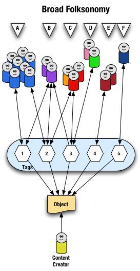
From a high level we see a person creates the object (content) and makes it accessible to others. Other people (groups of people with the same vocabulary represented people blobs and noted with alphabet letters) tag the object (lines with arrows pointing away from the people) with their own terms (represented by numbers). The people also find the information (arrows on lines pointing from the numeric tags back to the people blobs) based on the tags.
Digging a little deeper we see quite a few people (8 people) in group "A" and they have tagged the object with a "1" and a "2" and they use this term to find the object again. Group "B" (2 people) have applied tag "1" and "2" to the object and they use tag terms "1", "2", and "3" to find the information. Group "C" (3 people) have tagged the object with "2" and "3" so that they can find the object. Group "D" has also tagged the object with tag "3" so that they may refind the information this group may have benefitted from the tagging that group "C" provided to help them find the information in the first place. Group "E" (2 people) uses a different term, "4", to tag the object than others before it and uses only this term to find the object. Lastly, group "F" (1 person) uses tag "5" on the object so that they may find it.
Broad Folksonomy and the Power Curve
The broad folksonomy provides a means to see trends in how a broad range are tagging one object. This is an opportunity to see the power law curve at work and show the long-tail.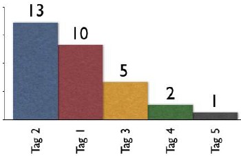
The tags spike with tag "2" getting the largest portion of the tags with 13 entries and tag "1" receiving 10 identical tags. From this point the trends for popular tags are easy to see with the spikes on the left that there are some trends, based on only those that have tagged this object, that could be used extract a controlled vocabulary or at least know what to call the object to have a broad spectrum of people (similar to those that tagged the object, and keep in mind those that tag may not be representative of the whole). We also see those tags out at the right end of the curve, known as the long tail. This is where there is a small minority of people who call the object by a term, but those people tagging this object would allow others with a similar vocabulary mindset to find the object, even if they do not use the terms used by the masses over at the left end of the curve. If we take this example and spread it out over 400 or 1,000 people tagging the same object we will se a similar distribution with even more pronounced spikes and drop-off and a longer tail.
This long tail and power curve are benefits of the broad folksonomy. As we will see the narrow folksonomy does not have the same properties, but it will have benefits. These benefits are non-existent for those just simply tagging items, most often done by the content creator for their own content, as is the means Technorati has done, even with their following tag links to destinations other than Technorati (as they initially had laid out). The benefits of the long tail and power curve come from the richness provided by many people openly tagging the same object.
Narrow Folksonomy
The narrow folksonomy, which a tool like Flickr represents, provides benefit in tagging objects that are not easily searchable or have no other means of using text to describe or find the object. The narrow folksonomy is done by one or a few people providing tags that the person uses to get back to that information. The tags, unlike in the broad folksonomy, are singular in nature (only one tag with the term is used as compared to 13 people in the broad folksonomy using the same tag). Often in the narrow folksonomy the person creating the object is providing one or more of the tags to get things started. The goals and uses of the narrow folksonomy are different than the broad, but still very helpful as more than one person can describe the one object. In the narrow the tags are directly associated with the object. Also with the narrow there is little way of really knowing how the tags are consumed or what portion of the people using the object would call it what, therefore it is not quite as helpful as finding emerging vocabulary or emergent descriptions. We do find that tags used to describe are also used for grouping, which is particularly visible and relevant in Flickr (this is also done in broad folksonomies, but currently not to the degree of visibility that it is done on Flickr, which may be part of the killer interactive environment Ludicorp has created for Flickr).
The narrow folksonomy is illustrated as follows.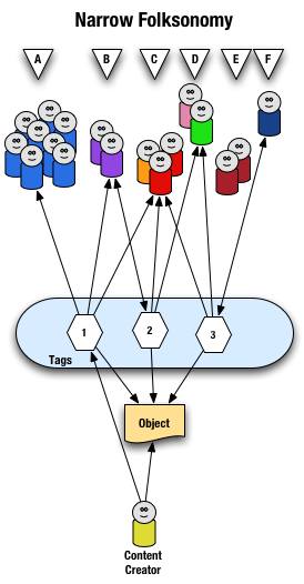
From a high level we see a person creates the object and applies a tag ("1") that represents what they call the object or believe describes the object. There are fewer tags provided than in a broad folksonomy and there is only one of each tag applied to the object. The consumers of the object also can apply tags that help them find the object or describe what they believe are the terms used to describe this object.
A closer look at the interaction between people and the object and tags in a narrow folksonomy shows us that group "A" uses tag "1" to find and come back to the object (did the creator do this on purpose? or did she just tag it with what was helpful to her). We see group "B" also using tag "1" to find the object, but they have tagged the object with tag "2" to also use as a means to find the object. Group "C" uses tag "1","2", and "3" to find the object and we also note this group did not apply any of its own tags to the object as so is only a consumer of the existing folksonomy. We see group "D" uses tags "2" and "3" to find the objects and it too does not add any tags. Group "E" is not able to find the object by using tags as the vocabulary it is using does not match any of the tags currently provided. Lastly, group "F" has their own tag for the object that they alone use to get back to the object. Group "F" did not find the object through existing tags, but may have found the object through other means, like a friend e-mailed them a link or the object was included in a group they subscribe to in their feed aggregator.
We see that the richness of the broad folksonomy is not quite there in a narrow folksonomy, but the folksonomy does add quite a bit of value. The value, as in the case of Flickr, is in text tags being applied to objects that were not findable using search or other text related tools that comprise much of how we find things on the internet today. The narrow folksonomy does provide various audiences the means to add tags in their own vocabulary that will help them and those like them to find the objects at a later time. We are much better off with folksonomies than we were with out them, even if it is a narrow folksonomy being used.
Conclusion
We benefit from folksonomies as the both the personal vocabulary and the social aspects help people to find and retain a tether to objects on the web that are an interest to them. Who is doing the tagging is important to understand and how the tags are consumed is an important factor. This also helps us see that not all tagging is a folksonomy, but is just tagging. Tagging in and of its self is a helpful step up from no tagging, but is no where near as beneficial as opening the tagging to all. Folksonomy tagging can provide connections across cultures and disciplines (an knowledge management consultant can find valuable information from an information architect because one object is tagged by both communities using their own differing terms of practice). Folksonomy tagging also makes up for missing terms in a site's own categorization system/taxonomy. This hopefully has made things a little clearer for all in our understanding the types of folksonomies and tagging and the benefits that can be derived.
This entry first appeared at Personal InfoCloud and comments are open for your use there.
The Future of Newspapers
A state of the newspaper industry article in today's Washington Post tries to define what people want from newspapers and what people are doing to get information.
Me? I find that newspapers provide decent to great content. Newspapers are losing readers of their print versions, but most people I know are new reading more than one paper, but online. The solutions I see from my vantage are as follows.
Ads
The articles rarely have ads that relate to the stories, foolishly missing ad revenues. The ads that are available are distracting and make for an extremely poor experience for the reader. News sites should ban the improperly targeted inducements that rely on distracting from reading the article, which is the reason the person is on that web page. The person has an interest in the topic. There are monetary opportunities to be had if the news outlets were smart and advertisers were smart.
How? If I am reading an article on the San Francisco Giants I would follow and may pay a little something for an ad targeted to this interest of mine. I like to buying Giants tickets, paraphernalia, a downloadable video of the week's highlights, etc. If I am reading about an airline strike a link to train tickets would be a smart option. A news article about problems in the Middle East could have links to books by the journalist on the subject, other background books or papers, links to charitable organizations that provide support in the region. The reader has shown an interest, why not offer something that will also be of interest?
We know that advertisers want placement in what they consider prime territory, the highly trafficked areas of the site. Often this is when the non-targeted ads appear. This is an opportunity to have non-targeted ads pay a premium, say five to 20 times that of targeted ads. The non-targeted ads have to follow the same non-disruptive guidelines that targeted ads follow. This is about keeping the readers around, without readers selling ads does not make any sense.
Archives
One area the news site are driving me crazy is access to the archives. The news sites that require payment to view articles in the archives are shooting themselves in the foot with this payment method and amount required to cough up to see an article that may or may not be what the person interested is seeking. The archives have the same opportunity to sell related ads, which in my non-professional view, would seem like they would have more value as the person consuming the information has even more of an interest as they are more than a casual reader. Any payment by the person consuming the information should never be more than the price for the whole print version. The articles cost next to nothing to store and the lower the price the more people will be coming across the associated advertising.
Blogging and personal sites often point to news articles. Many of us choose whom we are going to point to based on our reader's access to that information at any point in the future. We may choose a less well written article, but knowing it will be around with out having to pay extortionist rates to see it is what many of us choose. Yes, we are that smart and we are not as dumb as your advertisers are telling you. We, the personal site writers are driving potential ad revenues to you for free, if you open your articles for consumption.
Loyalty
Loyalty to one paper is dead, particularly when there are many options to choose to get our news from. We can choose any news source anywhere in the world. Why would we choose yours? Easy access, good writing, point of view, segment coverage (special interests - local, niche industries, etc), etc. are what drive our decisions.
I often choose to make my news selections to include sources from outside my region and even outside my country. Why? I like the educated writing style that British sources offer. I like other viewpoints that are not too close to the source to be tainted. I like well researched articles. I like non-pandering viewpoints. This is why I shell out the bucks for the Economist, as it is far better writing than any other news weekly in the U.S. and it pays attention to what is happening around the world, which eventually will have an impact to me personally at some point in the future. I don't have patience for mediocrity in journalism and the standards for many news sources have really slipped over the past few years.
News sources should offer diversity of writing style and opinion of one source will attract attention. The dumbing down of writing in the news has actually driven away many of those that are willing to pay to read the print versions. Under educated readers are not going to pay to read, even if it is dumbed down. Yes, the USA Today succeeded in that, but did you really want those readers at the loss of your loyal revenue streams?
Loyalty also requires making the content available easily across devices. Time and information consumption has changed. We may start reading an article in the print edition (even over somebody's shoulder and want to follow-up with it. We should be able to easily find that article online at our desk or from our mobile device. Integration of access across devices is a need not a nicety and it is not that difficult to provide, if some preparation is done with the systems. Many of us will pull RSS feeds from our favorite news sources and flag things for later consumption, but the news sites have not caught on how to best enable that. We may pull feeds at one location, but may have the time and focus to read them at another location, but we may not have the feeds there. Help those of us that are loyal consume your information in a pan-medium and pan-device world that we live in.
All the Blog that is Fit To...
From the blog realm. Elise Bauer provides an excellent overview of available blog tools. This is a very good article on the business of weblog tool development and what the tools offer.
The fine folks at Six Apart launched their redesign today. Not only is there a new look, but the navigation is improved and is now consistent. All of the Six Apart properties are now united, which is also very helpful. Their site is looking less like a blog and more like a professional software company, but the secret it is their sites are run by their blogging tools. Great job 6A and Mule who did much of the work!
Books Read in 2004
I bought and read one standout book this year, Malcolm McCullough's Digital Ground mixed in with many more that I enjoyed. Digital Ground stood out as it combined a lot of things I had been thinking about, but had not quite pulled together. It brought interaction design front and center in the ubiquitous computing and mobile computing spectrum. I have been working on the Personal InfoCloud for a few years now and this really moved my thinking forward in a great leap. I considering better questions and realizing there are many next step, but few of these next steps the design community (in the broad user experience design sense) seems ready for at this time. One of the key components that is not was thought through is interaction design and the difference place makes in interaction design. It was one book that got my highlighter out and marking up, which few books have done in the past couple years.
I greatly enjoyed the troika of books on the mind that came out in 2004. The first was Mind Wide Open by Stephen Berlin Johnson, which was a relatively easy read and brought to mind much of how we use are minds in our daily lives, but also how we must think of the coginitive processes in our design work. Mind Wide Open focussed on improving one's attention, which is helpful in many situations, but I have had a running question ever since reading the book regarding focus of attention and creative problem resolution (I do not see focus of attention good for creative problem resolution).
The second book was On Intelligence by Jeff Hawkins. On Intelligence is similar to Mind Wide Open, but with a different frame of reference. Hawkins tries to understand intelligence through refocussing on predictive qualities and not so much on results based evaluation (Turing Test). I really like the Hawkins book, which throws in some guesses in with scientifically proven (unfortunately these guesses are not easily flagged), but the predictive qualities and the need for computing to handle some of the predictive qualities to improve people's ability to handle the flood of information.
Lastly, for in the mind book troika I picked up and have been reading Mind Hacks by Tom Stafford and Matt Webb. This is one of the O'Reilly Hack series of books, but rather than focussing on software, programming, or hardware solutions these to gents focus on the mind. Mind tricks, games, and wonderful explainations really bring to life the perceptions and capabilites of the grey lump in our head. I have been really enjoying this as bedtime reading.
Others in related genres that I have read this year, Me++: The Cyborg Self in the Networked City by William Mitchell, which was not a soaring book for me, mostly because Ihad just read Digital Ground and it should have been read in the opposite order, if I had cared to. Linked: How Everything is Connected to Everything Else and What it Meands by Albert-Laszlo Barabasi was a wonderful read, once I got through the first 20 pages or so. I had purched the book in hardback when it first came out and I was not taken by the book in the first 20 pages. This time I got past those pages and loved every page that followed. Barabasi does a wonderful job explaining and illustrating the network effect and the power curve. This has been incorporated into my regular understanding of how things work on the internet. I have learned not to see the power curve as a bad thing, but as something that has opportunities all through out the curve, even in the long tail. On the way back from Amsterdam I finally read Invisible Cities by Italo Calvino, which was quite a wonderful end to that trip.
I picked up a few reference books that I enjoyed this year and have bought this year and have proven to be quite helpful. 250 HTML and Web Design Secrets by Molly Holzschlag. CSS Cookbook by Chris Schmitt. More Eric Meyer on CSS by Eric Meyer.
On the Apple/Mac front the following reference books have been good finds this year. Mac OS X Unwired by Tom Negrino and Dori Smith. Mac OS X Power Hound by Rob Griffths.
Two very god books for those just starting out with web design (Molly's book above would be a good choice also). Web Design on a Shoestring by Carrie Bickner. Creating a Web Page with HTML : Visual QuickProject Guide by Elizabeth Castro.
The year started and ended with two wonderful Science Fiction romps. Eastern Standard Tribe by Cory Doctorow. Jennifer Government by Max Barry.
Update: I knew I would miss one or more books. I am very happy that 37signals published their Defensive Design for the Web: How To Improve Error Messages, Help, Forms, and Other Crisis Points, as it is one of the best books for applications and web development on how to get the little things right. The tips in the book are essential for getting things right for the people using the site, if these essentials are missed the site or application is bordering on poor. Professionally built sites and applications should work toward meeting everything in this book, as it is not rocket science and it makes a huge difference. Every application developer should have this book and read it.
Information Waste is Rampant
Fast Company published costs facing business. The top four relate to poor design and information use: Poor knowledge harnessing ($1.4 Trillion); Digital publishing inefficiencies ($750 billion); Data quality problems ($600 billion); and Paper-based trade processes ($400 billion). That is 3.15 Trillion U.S. dollars down the tubes with no benefit.
The solutions are not that difficult, but everybody seems happy to use the rear view mirror to view the future.
Christina stated, "What me worry" about design and business. The whole CIO is a sham as the CIO is a technology driven person, which is tangentially related to information and technology still hinders information flow if not planned for properly (more on this is coming in the near future here on this site). There needs to be a chief level position that cares about the information, the people using it, and the people who create the information. To Christina's post I responded with the following on her site (posted here so I can better keep track of it):
It seems like the 80s all over again. The focus on design in the to late 80s, mostly with unified branding and creative practices formally brought in-house. There was a lot of push around design, mostly labelled branding (nearly the exact same discussions, but slightly different terms). Much of this was around the brandhouses like Landor. The business community embraced the results and tried to incorporate the creative culture as part of their own.
What happened? The innovators were bought by large advertising or public relation firms and the firms changed their industry term to communication companies. Companies created corporate communication divisions (comprised of adversising, PR, branding, and other creative endevors) and had high level management visability.
By the early 90s the corporate environment had largely subsumed the communication into marketing and business schools that has embraced the creative mindset followed suit. Today marketing is often what trumps design and there is no creative in marketing. The creative departments by the late 90s had been gutted by the web craze. This left business types with little creative craft understanding as those driving what was once good.
It is not suprising that currently named "design" is taking off, as what was good about the creative was gutted and most companies lack central design plans. There is tremendous waste in cross medium design, as few sites are built with an understanding of the digital medium, let alone cross platform design or true cross media design. Part of the problem is far too few designers actually understand cross-platform and/or cross-media design. There is millions wasted in bandwidth on poor web design that is using best practices from the late 90s not those from today. There is no integration of mobile, with a few exceptions in the travel industry. There is still heavy focus on print, but very little smart integration of design in the digital medium. This even applies to AIGA, which is a great offender of applying print design techniques on the web. How can we expect business design to get better if one of the pillars of the design profession has not seemed to catch on?
There are large problems today and we need to break some of our solutions were have been trying to get to solutions that work. Not only do today's solutions not work today, they will not work tomorrow as they are only stop gaps. Cross-platform, cross-device, and cross-medium design solutions are needed, but technology is not here to deliver and few that I have run across in the design world are ready for that change as they have not made the change to today's world.
Today's designer focusses on getting the information in front of the user and stops there. They do not consider how this person or machine may reuse the information. There is so much yet to improve and yet the world is progressing much faster than people can or want to change to keep up. There are designers and developers who will not build for mobile (it is not that hard to do) because they do not see them in the user logs. They fail to see the correlation that their sites suck for mobile and mobile users may test once and go somewhere else for their information. The people that are seeing mobile users in their logs are the ones that have figured out how to design and develop for them properly (most have found that it is relatively inexpensive to do this). This is not rocket science, it is using something other than the rear view mirror to design for now and the future.
Flickr and the Future of the Internet
Peter's post on Flickr Wondering triggers some thoughts that have been gelling for a while, not only about what is good about Flickr, but what is missing on the internet as we try to move forward to mobile use, building for the Personal InfoCloud (allowing the user to better keep information the like attracted to them and find related information), and embracing Ubicomp. What follows is my response to Peter's posting, which I posted here so I could keep better track of it. E-mail feedback is welcome. Enjoy...
You seemed to have hit on the right blend of ideas to bring together. It is Lane's picture component and it is Nadav's integration of play. Flickr is a wonderfully written interactive tool that adds to photo managing and photo sharing in ways that are very easy and seemingly intuitive. The navigations is wonderful (although there are a few tweak that could put it over the top) and the integration of presentational elements (HTML and Flash) is probably the best on the web as they really seem to be the first to understand how to use which tools for what each does best. This leads to an interface that seems quick and responsive and works wonderfully in the hands of many. It does not function perfectly across platforms, yet, but using the open API it is completely possible that it can and will be done in short order. Imagine pulling your favorites or your own gallery onto your mobile device to show to others or just entertain yourself.
Flickr not only has done this phenomenally well, but may have tipped the scales in a couple of areas that are important for the web to move forward. One area is an easy tool to extract a person's vocabulary for what they call things. The other is a social network that makes sense.
First, the easy tool for people to add metadata in their own vocabulary for objects. One of the hinderances of digital environments is the lack of tools to find objects that do not contain words the people seeking them need to make the connection to that object they are desiring. Photos, movies, and audio files have no or limited inherent properties for text searching nor associated metadata. Flickr provides a tool that does this easily, but more importantly shows the importance of the addition of metadata as part of the benefit of the product, which seems to provide incentive to add metadata. Flickr is not the first to go down this path, but it does it in a manner that is light years ahead of nearly all that came before it. The only tools that have come close is HTML and Hyperlinks pointing to these objects, which is not as easy nor intuitive for normal folks as is Flickr. The web moving forward needs to leverage metadata tools that add text addressable means of finding objects.
Second, is the social network. This is a secondary draw to Flickr for many, but it is one that really seems to keep people coming back. It has a high level of attraction for people. Part of this is Flickr actually has a stated reason for being (web-based photo sharing and photo organizing tool), which few of the other social network tools really have (other than Amazon's shared Wish Lists and Linkedin). Flickr has modern life need solved with the ability to store, manage, access, and selectively share ones digital assets (there are many life needs and very few products aim to provide a solution for these life needs or aims to provide such ease of use). The social network component is extremely valuable. I am not sure that Flickr is the best, nor are they the first, but they have made it an easy added value.
Why is social network important? Helping to reduct the coming stench of information that is resultant of the over abundance of information in our digital flow. Sifting through the voluminous seas of bytes needs tools that provide some sorting using predictive methods. Amazon's ratings and that matching to other's similar patterns as well as those we claim as our friends, family, mentors, etc. will be very important in helping tools predict which information gets our initial attention.
As physical space gets annotated with digital layers we will need some means of quickly sorting through the pile of bytes at the location to get a handful that we can skim through. What better tool than one that leverages our social networks. These networks much get much better than they are currently, possibly using broader categories or tags for our personal relationships as well as means of better ranking extended relationships of others as with some people we consider friends we do not have to go far in their group of friends before we run into those who we really do not want to consider relevant in our life structures.
Flickr is showing itself to be a popular tool that has the right elements in place and the right elements done well (or at least well enough) to begin to show the way through the next steps of the web. Flickr is well designed on many levels and hopefully will not only reap the rewards, but also provide inspiration to guide more web-based tools to start getting things right.
Mobile in Suburbia
Last weekend I stopped in one of our local malls to do a little shopping before Christmas. The mall, White Flint, is a decent small suburban shopping mall. The mall has just gone through a minor renovation. One of the things that was added were small sitting areas in the center areas of the mall. They are nice little conversation areas to stop and rest your feet, etc.
One of the things in nearly every hand in the lounge areas was a mobile device. The age range was 30s to 60s and nearly every person had a device in their hands. There where some mobile phones, but most of what I saw were BlackBerry's and Treos. I don't know what tasks these people were doing, whether it was e-mail, games, checking shopping lists, price comparing on the web, text messaging, or what.
It dawned on me. Suburbia is onto mobile. Coming back from Europe in November I was down about how far behind the U.S. is with mobile (and personal technology use in general). One of the things that gets a lot of attention is urban use of mobile devices, but much of the U.S. is not urban it is out in the 'burbs. Molly presented a view of suburbia at Design Engaged and it has had me thinking about how people deal with information and how they use personal technology in suburbia. The mobile devices at the mall was an eye opener (granted I do not live in test market America as a mall with valet parking may not count as representative of the rest of anywhere). The mobile uses in Japan are reported as largely during commutes and walking time. In Europe I witnessed similar trends. In the U.S. we are married to the car (for better or worse), but we do go to the mall and leisure activities for families in suburbia revolves around kids sporting events, extra curricular activities, shopping, and waiting in lines. There is a lot of down time and it seems mobile has an opportunity to be the snack entertainment and information consumption time.
The trick is how to integrate mobile into the rhythms of the suburban life. How to use mobile to check and reset Tivo settings, get store and price information for items on the mobile user's or their family's Amazon wishlist. There are uses for pointers about cheapest gas when your car is getting low or a nearby car wash just after it rains. The mobile device can make easy work of this and it does not require much computing power, only some location and predictive web services.
There is so much more that could be done, but the carriers are completely clueless in the U.S. about services. It seems like it is prime target area for a Yahoo, Google, or Amazon that can integrate related information and provide quick responses to the users of their service. It much be effortless and painless. It must be a benefit but unobtrusive. It must respect the person and their desires for sharing information about them, but still provide predictive input for the person's uses.
I think we just expanded the Personal InfoCloud one more rich layer.
Personal Mobile Usage Pattern
One of the things that bubbled up while using a phone other than my usual phone on my trip to Amsterdam was my normal use patterns. I use my mobile phone (Palm Treo) not only to communicate with others, but also to communicate with myself.
I often send myself e-mails with ideas for projects or articles. I also send e-mails to myself on things to spend time thinking about later or to research later. I had one of these moments in talking with Peter Bogaards about Paul Otlet, whom I have problems remembering. I started reaching for my tool to send a note and had a different phone, which took a little more effort, but got the job done.
I also SMS myself with the cross streets of where I parked my car, or what garage level and other metadata. This solves an ongoing problem, particularly in Georgetown, where my normal parking patterns are ousted, I am parking in a completely new location, or parking in long term at an airport. All part of my mind occasionally not being on the task at hand or I am just deep in thought and did not make a conscious effort to remember where I parked.
One other usage I have is taking a photo of my radio display in my car or the song name and performer. This mostly happens when listening to XM Radio (satellite) as the options are broad and deep, which works wonders for coming across new music I like. The radio in my car does not have a means to save the song name, or even better would be to e-mail me the song info, a link to listen to a snippet, and buying information. I resort to the tools at hand. Yes, I only (well usually) take photos while stopped. I usually have 5 to 10 photos of my radio on my mobile at any one time. It makes it handy when I go into a music store or wait until I can put it in a wishlist online. I use my Amazon Wishlist to find items of interest in a store or to add to my Wishlist and having that live access has made things far better for me as a consumer (my only desire is to have a better mobile interface to one's own Wishlist on a mobile it would seem to have immense benefits for Amazon).
I also browse the web and read articles that I save down to my device to I have access in no-signal zones or zones that I do not have MMS or web access and just phone (DC METRO while underground). I often save down Boxes and Arrows articles for such trips. I also push articles and presentations I am working on to my mobile as back up as well as for review in down periods.
How do you use your mobile?
Cranky Interface to Bits and Bytes
Been a little cranky around these parts the past week or so. Much of it having to do with having personal observations of the web and design world fortified by my trip to Europe. The market I work in is somewhat behind what is going on in the U.S. in the design and information development is concerned. But, some of the problems I have been seeing as I have been working on Model of Attraction and Personal InfoCloud projects is a severe lack of understanding the cross device problems that users are running into.
My trip to Europe solidified the my hunch that others outside the U.S. are actually working to solve some the user cross device problems that occur. It seems the European market is at least thinking of the problems users face when going from a work desktop machine, to laptop, to mobile device and trying to access information. The U.S. is so desktop and laptop centered they are seemingly blind to the issues. Some of the problems everybody is facing are caused by the makers of the operating systems as the problems with syncing often begin with the operating system. Apple is definately ahead of others with their iSync, but it still has a ways to go.
It is painful to see many sites for mobile products in the U.S. that can't work on mobile devices because they are poorly designed and some even use FrontPage to throw their crud up. I have been finding many mobile users over the past year, across locations in the U.S., that find that lack of sites that will work on a mobile device appalling.
On the other side of the market I hear developers stating they do not develop for mobile users because they do not see them in their access logs. How many times do you think a user will come back and fill your user logs if your site does not work for them? Additionally we are talking about the internet here, not U.S. only information access points, and the rest of the world is mobile they are living in the present and not in the past like the U.S. I am being a little over the top? Not by much if any.
Part of the problem is only those around urban in the U.S. and ones that have usable public transit have the opportunity to use mobile devices similar to the rest of the world. Although mobile media streamed of a mobile is a killer application for those stuck in the commute drive (Fabio Sergio's From Collision to Convergence presentation at Design Engaged really woke me up to this option).
Getting back to information following the user... Providing mobile access to information is one solution and designers and developers have been making the web harder to use by not sticking to the easiest means of presenting information across all devices, XHTML. Information is posted in PDF with out notification that the information on the other side of the link is a PDF. After a lengthy download the mobile user gets nothing at best or their device locks up because it is out of memory or it can not process the PDF. This practice is getting to be just plain ignorant and inexcusable (ironically the U.S. Federal Communications Commission follows this practice for most of its destination pages, which only shows how far behind the U.S. truly is).
Another solution is to make it easier to sync devices across distance (not on the same network) or even have one's own information accessible to themself across the internet. Getting to the point of solving these problems should be around the corner, but with so many things that seem so simple to get and have not been grasped I have dented hope and frustration.
Model-T is User Experience Defined
Peter Boersma lays out Model T: Big IA is UX. I completely agree with this assessment and view. The field of Information Architecture is very muddled in the eyes of clients and managers as those pitching the services mean different things. Personally I think Richard Saul Wurman's incredible book on information design labeled "Information Architecture" caused a whole lot of the problem. The little IA was evident in the Wurman book and there are many concepts that were delivered to the IA profession from that book, but it was largely about information design.
Getting back to Peter Boersma's wonderful piece, the Model-T hits the correlated professions and roles dead on. This is essentially how things are organized. There are some of us that go deep in more than one area and others that are shallow in most, but also tend to provide great value.
Emerging Class Divide with Technology
Ben Hammersly does a wonderful job of highlighting the current state of The Emerging Two Cultures of the Internet and extends it in More on the Emerging Two Cultures. The two cultures are the geeks and real people. There are many tools and means to access digital information on the internet, but these are mostly available to the geeks that are early adopters or in some cases the adopters. Ease of use has not hit many of our friends and relatives.
Ben looks at the web as an place that again takes increasing knowledge and understanding of the arcane to get through the mire of spam, nefarious pop-ups, and viruses. There are some of us that understand how to go about doing this dance (or bought a Mac to make the whole thing easier) and do not find it difficult, but many would like to have the hours back to work on things more fun. The average person does not have the capabilities or time to stay on top of all these things. Ben's description of the Windows XP SP2 pitfall is right in line with the diverging communities. There is not a need for these, if things were done better in the first place.
Easing the Digital Realm
We have a system of tools that make information creation easy in digital formats. These tools may not be our best friend as of yet as many tools may be seemingly easy to use, but the tools are lacking when trying to easily develop information in an optimal format to ease the use of the information by the person consuming or interacting with that information. As people accessing information we find a lot of information, we may not always find the information we desire or need.
But, once we get the information and try to consume that information by copying parts into our reference notes for our work we run into difficulties. We also have problems storing the information so we can have it at the ready when we need it. It is very difficult, not impossible, to have information follow us in our Personal InfoCloud, which is our repository of information we want following us for our easy use and reuse.
Unfortunately those of us that can wrangle and have the time to wrangle with the tools to get them to easily, efficiently, and accurately perform in a manner that makes our lives easier are relatively few. There should not be two classes of people, things need to get better. The focus needs to get on the people using information and trying to reuse it.